windows9ao3 - a lesson in css bullshittery
7 June 2026
Hmmm, I wonder if I can make an interactive desktop in AO3...
Oh.
Oh
That One Fateful January Day...
...I was struck by a sudden need to create a desktop interface in the fanfiction website known as Archive of Our Own (or AO3). This single, ostensibly harmless (but secretly evil), urge went on to consume the better part of two months of my life. This article is my best attempt to detail my slightly deranged processes, and to outline some of the frankly absurd techniques I came up with to circumvent AO3s content restrictions. It's... a lot of text, but the interactive html demos I've included should help to make it a touch more digestable. And my hope is that you'll have a few new tools in your toolbox for the next time you want to do some html abuse.
With that said...
I don't remember the exact circumstances that birthed this terrible idea. But! It was largely inspired by a certain deltarune ARG (that I still haven't gotten around to looking at :cries:). I had recalled coming across it a few months earlier, and it had stuck with me: It was a really awesome collection of pages, which formed a (to me) almost never ending rabbit-hole of Deep Deltarune Lore Speculation TM. And their presentation - a pseudo-realistic old operating system - combined with the inherent bolt of inspiration that invariably strikes you down in early January, some dozen days before you have to return to school, awakened something in me. It was the will to Fuck Around And Find Out.
Originally, this was going to be nothing more than a desktop with some icons you could click to bring up some simple, static windows. I had little experience with the limited "flavour" of html & css that AO3 provides and figured, without much thought, that it would be too limitied to do anything else. And I was happy with this. I'd be able to have some fun writing and coding for a week or two, making a quick and simple "point-and-click-adventure" game using basic css features. Oh, and also: it was supposed to be related to deltarune.
But... uh... things didn't turn out that way, and I ended up with an original story set in an interactive windows98 interface - about the moon and time travel? (probably, I don't really know exactly what came out of my brain during the almost-all-nighter I pulled trying to finish writing everything after having spent all of my time budget on coding) Featuring:
- A file explorer, that can view text documents and images
- An internet explorer clone with a plethora of websites - and functioning forwards/backwards history navigation
- Moveable and resizeable windows
- Windows dialog boxes for errors
- A boot sequence
- and some more fun things...
All made without such terrible, WOKE, unbased features such as Javascript (ew), css animations (what are those?), and html elements other than <div>s (okay I used a few, but theoretically, you could replace the <p>s and <img>s etc with <div>s).
Now if you're wondering what exactly such a task entails, or just want to be reminded of the pain and suffering that is AO3 styling, let me present to you:
An (Un)Official Guide To Increasing Anxiety And Blood Pressure Through HTML & CSS - AO3 Edition
If one is to attempt to document the mess that is AO3's support for HTML and CSS, then there's no better place to start their official list of "Allowed HTML"
a, abbr, acronym, address, [align], [alt], [axis], b, big, blockquote, br, caption, center, cite, [class], code, col, colgroup, dd, del, details, dfn, div, dl, dt, em, figcaption, figure, h1, h2, h3, h4, h5, h6, [height], hr, [href], i, img, ins, kbd, li, [name], ol, p, pre, q, rp, rt, ruby, s, samp, small, span, [src], strike, strong, sub, summary, sup, table, tbody, td, tfoot, th, thead, [title], tr, tt, u, ul, var, [width](This list is shown in a popup accessible when creating a work in ao3, but since I can't exactly link that here, I managed to find this page that may or may not exist by the time you're reading this. Also that list isn't complete, but let's pretend it is and deal with that later1.)
Now, for our purposes, most of these are irrelevant. (Also, ignore the attribute names in the '[...]'s) So let's spend a few moments sorting through this list to find everything that might be useful for creating anything interactive (seeing as how we don't have access to script tags).
addr,acronym,address,b,big,blockquote,center,cite,dd,del,dfn,dl,dt,em,h1,h2,h3,h4,h5,h6,i,ins,kbd,pre,q,s,samp,small,strike,strong,sub,sup,u,tt, andvarare all basically just css-classes packaged into elements. Their behaviour can be replicated without any issue and thus they are pretty useless for us, seeing as how the abomination we're going to make will not conform to any "semantic HTML" standards.ul,li, andoljust let us automatically prepend list indices to our text. Not all that useful.caption,col,colgroup,table,tbody,td,tfoot,th,thead, andtrlet us make tables, which, while being nice for laying out content, don't let us do anything we couldn't do with some css.figcaptionandfigureare just some more "semantic HTML" nonsense I think, but for images instead of text. In any case: Useless! (I have since learned thatfigureelements prevent AO3's HTML parser from playing paragraph-tag-roulette on its contents, which is very useful when you don't want to spend hours debugging an image being messed up on AO3, only to find out that there's a paragraph tag wrapped around it. I solemnly apologize to anyfigurelovers.).brandhrgive us some fancy, albeit not useful, spacing (However, while not relevant here,hrtags are self closing, while also being able to take up space on the page, which make them ideal when you want a lot ofhoverable elements in a small file size).- Finally,
rp,rt, andrubylet us do some more fancy text formatting that could be accomplished with some determinedposition: absolute;ing.
This leaves us with just seven (Seven!) elements to work with. These being a, details, div, img, p, span, and summary. And after this rapid-fire segment, I think each of these deserves some more details (haha i am very funny).
<a>-tags
The humble anchor tag lets us do a whole lot of fun stuff. Their main use - linking to other pages - isn't worth much, as I want to keep my humble little game on a single AO3-page2. But, of course, there is another way to use them.
By specifying a URI fragment, something akin to <a href="https://example.com/page#myfragment">link woo!</a>, we can actually use anchor tags to store state. Clicking on such a link (provided that the non-fragment part is identical to the current url) does not refresh the page, but instead navigates to whichever element on the page that has the id myfragment.
(Of course, because this is AO3, it's not quite that simple. AO3 doesn't allow us to specify the id-attribute directly, and instead we have to use another anchor tag and set its name-attribute to myfragment. Then AO3's html-processor will add the id-attribute for us. If you know why they do this, please tell me, because I have no idea!)
Then we can change the content of the page with something like
.secret-content {
    display: none;
}
#workskin:has(#myfragment:target) .secret-content {
    display: block;
}
(in ao3, everything is wrapped within a div with an id of workskin [that is forcibly prepended to every css rule] so that you can't mess with the outer ui. Also, this article assumes that you are familiar with basic css syntax and selectors. if you don't know what :target does, then just search on mdn)
There are, however, a few issues with this approach:
- We can only store one bit of state at a time, provided that we don't start combining multiple states into single fragments (something like having
#state1,#state2, and#state1-and-state2. and then, ifstate1is enabled, replacing the anchor that triggersstate2with one that triggersstate1-and-state2.)... But that sounds absolutely miserable and would very quickly land us over the 500 KB limit for html and css in AO3. - The user must click (or use their keyboard, but that requires dealing with focus states and whatnot, and i don't want to think about that) on an element every time we want to change our state. This might not seem like an issue, but imagine, for instance, that we need to transition between states in some more complex way, and that we don't know where we'll end up until after the user has initiated the state transition. In this case, we don't have a choice but to clumsily require the user to click multiple times.
Something like Windows98 has, as one might assume, a lot of state. And some of it might change gradually, or in the background, or when the user hovers over some element. Therefore, anchor tags are not a good fit for this project (and in fact, I ended up only using them for their appearance, because I was lazy).
<details> and <summary>-tags
These are pretty cool, in the sense that they allow us to store state - like anchor tags. But unlike anchor tags, they bring us the great innovation of storing multiple pieces of state at once. In practice, we don't have to actually put anything inside the details-tags, since they allow us to query their state with the [open] css selector. This is the main reason they are useful, and, for instance, they can be used as checkboxes:
my awesome checkbox:<details><summary></summary></details>
summary {
  list-style: none;
  font-family: monospace;
}
summary::after {
  content: "[ ]";
}
details[open] summary::after {
  content: "[x]";
}
body:has(details[open]) {
  background-color: blue;
}
(this is a live demo. go and mess with the code to see what happens. or don't, im not your mom)
The one problem with these tags is that they're terrible. They let us query their state in css easily... But that's about it. Most important is the fact that the user has to click (or do keyboard navigation) on the element every time we want it to change state. This is bad for the same reasons as it was bad for anchor tags. We can't, for instance, perform any complex operations without requiring the user to click like a madman.
img, p and span
When it comes to actually displaying content on the screen, these are the tags that I ended up using. But... they don't exactly help us in creating an interactive desktop. (Technically, you could do without these, using background-image and content in css, but that seems a bit excessive)
...
And... That leaves us with (*checks notes*) just one tag:
The Humble div
If you think I'm insane for suggesting that you can make Windows98 in html with just divs, then know that I, too, thought such a feat was impossible before embarking on this journey.
Naturally, the secret sauce lies in the liberal use of some probably-very-not-standards-compliant css. However, much like how AO3 restricts what html we can use, it also limits us to a very limited subset of css. I say 'limited' here, not just in the sense of there being a lack of modern css properties, but in the sense that the most basic css properties are all that we have!
Do you like css animation? Well, Fuck you. The unpaid AO3 maintainers don't have time to implement a sanitizer for that!
Do you want custom fonts? Nope!
Media queries? Definitely not!! (though you can embed a svg with media queries in an img tag, but that doesn't do us much good because svgs in img tags are neutered3)
And then there are the restrictions on the properties, which, while (as mentioned) being much looser, still annoy me to no end!
Css grids? No! Variables? No! Counters? Well, they explicitly allow counter-increment and counter-reset but you can't display the counter! Transform? Well, yes, but only if you write them in a certain way, so that whatever abomination of a sequence of regexes AO3 is employing doesn't decide you need to be sentenced to eternal damnation! Etc etc
In the end, we're left with no way to store state and thus no way to execute logic. And indeed, this project seems hopeless...
...Until you remember that css transitions exist.
I would sell my soul to CSS Transitions
Transitions are conceptually simple. You set a transition, change some css property, and boom: it transitions!
<p>Hover Meeeeeeee!</p>
p {
    margin: 0;
    font-size: 2em;
    transition: font-size 2s ease-out;
}
p:hover {
    font-size: 6em;
}
The fun part comes when we make the transition take a reallllllllyyy long time. Like 2^31 - 1 seconds, for instance4.
<p>Hover Meeeeeeee!</p>
p {
    margin: 0;
    font-size: 2em;
    transition: font-size 0s linear 2147483647s;
}
p:hover {
    font-size: 6em;
}

/*for flavour!*/
p:hover::after {
    font-style: italic;
    opacity: 0.3;
    content: " nothing happens :(:(:(";
    font-size: 0.3em;
}
Well, that was fucking boring. Where is my skibi-gyatt? Certainly, we have verified that the browser does indeed do what we expect it to, but how can we use this behaviour?
Perhaps, we can change the transition delay back to normal on hover?
<p>Hover Meeeeeeee!</p>
p {
    margin: 0;
    font-size: 2em;
    transition: font-size 0s linear 2147483647s;
}
p:hover {
    font-size: 6em;
    transition-delay: 0s; /* this **should** be the same as writing `transition: font-size 0s ease-out 0s;` which is what i have always done. but doing it this way is a bit more explicit, i think */
}
Oh would you look at that! The text stays big even after we stop :hovering it (if it doesn't do this, then please contact me because i want to know what eldritch abomination of a browser has decided to break all of my stuff!)
This may not look all that impressive, but if we return to the two requirements I stated somewhere up above
- We need to store multiple states at once
- The user must not be required to click to change states
Well, we certainly didn't have to click anything to make the text grow. And hold on, let me just...
<p>Hover Meeeeeeee!</p>
<p>Hover Meeeeeeee2!</p>
<br><br><br>
<span>reset</span>
p {
    margin: 0;
    font-size: 2em;
    color: white;
    transition: color 0s linear 2147483647s;
}
p:hover:first-child {
    color: #f3cef8;
    transition-delay: 0s;
}
p:hover {
    color: #8ce6df;
    transition-delay: 0s;
}
body:has(span:hover) p {
    transition-delay: 0s;
    color: rgb(255, 255, 254);
}
...Yep, multiple pieces of state work just fine!
Attentive readers may, however, have noticed one small eensy teensy tiny little detail. The line
color: rgb(255, 255, 254);You can try to remove it, or change it to rgb(255, 255, 255); (or anything equivalent with white), and suddenly you will find yourself unable to reset the colors. This is, to say the least, a little bit counter-intuitive. And it is the first sign of many to come that we might be doing something that the dirty css committee does not approve of.
But it kind of makes sense. Setting the transition-delay, without changing the target state to something different than what the element is already transitioning to, won't initiate a new transition (when we stop hovering one of the ps, it starts a 'forever-transition' back to white. and I assume that the browser just doesn't bother to recalculate the transition until one of the transitioned properties changes. but i don't want to read the css spec so i'll never know for sure). But sure! Whatever. I can get used to that. Just change some rgb-values by 1 and we'll be fine.
(This will most definitely not become an issue later down the line.
This will not become an issue.
This will not-
Designing the Windows98y stuff
(i need to put something here so i don't have two headers in a row, so have a picture of some water lilies or something)
Windows
The first step in making Windows is, well, making windows. Ideally, we want them to be moveable, and probably also resizeable, but let's start with something simple.
<div class="window">
    <div class="titlebar">
        <p>Windowsy Window 9000</p>
    </div>
    <h1>Woo a window!</h1>
</div>
* {
margin: 0;
padding: 0;
color: blue;
}
body {
padding: 2em;
}
.window {
width: 200px;
height: 200px;
border: 2px ridge white;
}
.titlebar {
height: 30px;
width: 100%;
background-color: white;
}Woo a window!!
But what if the window could... Move?
To accomplish this Herculean task, we could create an element that, when hovered, moves the window to the right. Of course, we don't want the window to move back afterwards, but we just discussed how to avoid that!
<div class="window">
    <div class="titlebar">
        <p>Windowsy Window 9000</p>
    </div>
    <h1>Woo a window!</h1>
</div>
<br><br><br><br><br><br><br><br><br><br><br><br><br>
<span>hover me</span>
* {
margin: 0;
padding: 0;
color: blue;
}
/*body {
padding: 2em;
}*/
.window {
/* we make the window absolutely positioned so that we can move it easily */
position: absolute;
left: 2em;
/**/
width: 200px;
height: 200px;
border: 2px ridge white;
transition: all 0s linear 2147483647s;
}
.titlebar {
height: 30px;
width: 100%;
background-color: white;
}
body:has(span:hover) .window {
transition: all 1s linear 0s; /* here we don't want the window to snap into place. so therefore we add a transition duration. and at this point its quicker to use the `transition` shorthand */
left: 10em;
}(note that we are using position: absolute; here. using this method was the easiest way i found to get independent horizontal and vertical movement [which we will see very soon!]. But ideally, we would use transforms here since they are significantly faster to transition5 [and there is indeed a way to use transforms, but that is not what i used].)
This is, however, quite pathetic! No one wants windows like these! Could you imagine if you had to move your mouse over a tiny blue button every time you wanted to move your browser window to the right? And then you couldn't even move it back! It would be a permanent decision, and most surely wars would be fought over the optimal place to leave one's windows.
No, this won't do! Let's... create a joystick.
<div class="window">
    <div class="titlebar">
        <p>Windowsy Window 9000</p>
    </div>
    <h1>Woo a window!</h1>
</div>
<br><br><br><br><br><br><br><br><br><br><br><br>
<div class="joystick">
    <span class="up">UP</span>
    <span class="do">DO</span>
    <span class="le">LE</span>
    <span class="ri">RI</span>
</div>
* {
margin: 0;
padding: 0;
color: blue;
}
.window {
/* we make the window absolutely positioned so that we can move it easily */
position: absolute;
left: 2em;
top: 0em;
/**/
width: 200px;
height: 200px;
border: 2px ridge white;
/* notice that we apply transitions to both the `left` and `right` properties, which allows us to control them seperatly */
transition: left 0s linear 2147483647s, top 0s linear 2147483647s;
}
.titlebar {
height: 30px;
width: 100%;
background-color: white;
}
body:has(.up:hover) .window {
/* only allow `top` to transition */
transition: left 0s linear 2147483647s, top 1s linear 0s;
top: -10em;
}
body:has(.do:hover) .window {
transition: left 0s linear 2147483647s, top 1s linear 0s;
top: 10em;
}
body:has(.le:hover) .window {
/* only allow `left` to transition */
transition: left 1s linear 0s, top 0s linear 2147483647s;
left: -10em;
}
body:has(.ri:hover) .window {
transition: left 1s linear 0s, top 0s linear 2147483647s;
left: 10em;
}
span {
font-family: monospace;
position: absolute;
width: 30px;
height: 30px;
background: pink;
}
.joystick {
position: relative;
width: 90px;
height: 90px;
}
.up {
left: 30px;
}
.do/*wn*/ {
bottom: 0;
left: 30px;
}
.le/*ft*/ {
top: 30px;
}
.ri/*ght*/ {
right: 0;
top: 30px;
}We still have two problems.
- If you move the window right, just until it hits the 'edge', and then stop - then trying to move it the final distance will take a longer time than expected. In fact, it will take exactly 1 second, which is the transition duration that we have provided. What's happening is that the browser sees that the window has to move, say
15pxwith a duration of a second... Which of course takes an entire second! The solution is to simply extend the 'borders' wayyy past the screen (i.e. change10emto say1000em, while increasing thetransition-duration) so that the window always roughly has the same percentage left of its path, and thus always moves at a pretty consistent speed (if there's a better way of doing this, then let me know!) - The joystick is outside of the window!! What is this - Windows-negative-one?!
<div class="window">
    <div class="titlebar">
        <p>Windowsy Window 9000</p>
        <div class="joystick">
            <span class="up">UP</span>
            <span class="do">DO</span>
            <span class="le">LE</span>
            <span class="ri">RI</span>
        </div>
    </div>
    <h1>Woo a window!</h1>
</div>
* {
margin: 0;
padding: 0;
color: blue;
}
.window {
/* we make the window absolutely positioned so that we can move it easily */
position: absolute;
left: 2em;
top: 0em;
/**/
width: 200px;
height: 200px;
border: 2px ridge white;
/* notice that we apply transitions to both the `left` and `right` properties, which allows us to control them seperatly */
transition: left 0s linear 2147483647s, top 0s linear 2147483647s;
}
.titlebar {
height: 30px;
width: 100%;
background-color: white;
position: relative;
}
body:has(.up:hover) .window {
/* only allow `top` to transition */
transition: left 0s linear 2147483647s, top 100s linear 0s;
top: -1000em;
}
body:has(.do:hover) .window {
transition: left 0s linear 2147483647s, top 100s linear 0s;
top: 1000em;
}
body:has(.le:hover) .window {
/* only allow `left` to transition */
transition: left 100s linear 0s, top 0s linear 2147483647s;
left: -1000em;
}
body:has(.ri:hover) .window {
transition: left 100s linear 0s, top 0s linear 2147483647s;
left: 1000em;
}
span {
font-family: monospace;
position: absolute;
width: 90px;
height: 90px;
background: pink;
opacity: 0.5;
}
.joystick {
position: absolute;
width: 90px;
height: 90px;
top: -30px;
left: -30px;
}
.up {
bottom: 60px;
}
.do/*wn*/ {
top: 60px;
}
.le/*ft*/ {
right: 60px;
}
.ri/*ght*/ {
left: 60px;
}In this example, the hover areas have been scaled up a bit to make it easier to to use. Of course, there is still some work to be done! We probably don't want the joystick to be there constantly, as that would interfere with the content of the window. I solved this by only displaying it when the titlebar is :active. As a bonus, we can fill the titlebar a bunch of small divs, and instead of checking for :active on the entire titlebar, we can check it on these divs, and move the joystick to the appropriate div so that we can begin dragging from anywhere on the titlebar.
Additionally, we would probably want to add an element for each corner, so to enable diagonal movement. And expand the joystick to cover the entire screen, so that the mouse can't 'escape' if you move it too quickly.
For those who are interested in how this might work, you can play around with the following code, which I managed to extract from the finished project. Please do note that the code is hot garbage and will want to make you tear out your eyes!
(otherwise, just have some fun playing around with an ao3-compatible-window.6)
<div class="windows-container">
    <div class="window window-1 ">
        <div class="window-inner">
            <div class="wra wra-hor wra-hor-left">
                <div class="wr wr-left"></div>
                <div class="wr wr-right"></div>
            </div>
            <div class="wra wra-hor wra-hor-right">
                <div class="wr wr-left"></div>
                <div class="wr wr-right"></div>
            </div>
            <div class="wra wra-ver wra-ver-up">
                <div class="wr wr-up"></div>
                <div class="wr wr-down"></div>
            </div>
            <div class="wra wra-ver wra-ver-down">
                <div class="wr wr-up"></div>
                <div class="wr wr-down"></div>
            </div>
            <div class="window-titlebar">
                <div class="mover-anchors">
                    <div class="mover-anchor mover-anchor-0"></div>
                    <div class="mover-anchor mover-anchor-1"></div>
                    <div class="mover-anchor mover-anchor-2"></div>
                    <div class="mover-anchor mover-anchor-3"></div>
                    <div class="mover-anchor mover-anchor-4"></div>
                    <div class="mover-anchor mover-anchor-5"></div>
                    <div class="mover-anchor mover-anchor-6"></div>
                    <div class="mover-anchor mover-anchor-7"></div>
                    <div class="mover-anchor mover-anchor-8"></div>
                    <div class="mover-anchor mover-anchor-9"></div>
                    <div class="mover-anchor mover-anchor-10"></div>
                    <div class="mover-anchor mover-anchor-11"></div>
                    <div class="mover-anchor mover-anchor-12"></div>
                    <div class="mover-anchor mover-anchor-13"></div>
                    <div class="mover-anchor mover-anchor-14"></div>
                    <div class="mover-anchor mover-anchor-15"></div>
                    <div class="mover-anchor mover-anchor-16"></div>
                    <div class="mover-anchor mover-anchor-17"></div>
                    <div class="mover-anchor mover-anchor-18"></div>
                    <div class="mover-anchor mover-anchor-19"></div>
                </div>
                <div class="mover">
                    <div class="mover-hand mover-hand-Q mover-hand-up mover-hand-left "></div>
                    <div class="mover-hand mover-hand-W mover-hand-up "></div>
                    <div class="mover-hand mover-hand-E mover-hand-up mover-hand-right "></div>
                    <div class="mover-hand mover-hand-A mover-hand-left "></div>
                    <div class="mover-hand mover-hand-D mover-hand-right "></div>
                    <div class="mover-hand mover-hand-Z mover-hand-down mover-hand-left "></div>
                    <div class="mover-hand mover-hand-X mover-hand-down  "></div>
                    <div class="mover-hand mover-hand-C mover-hand-down mover-hand-right "></div>
                </div>
                <div class="window-icon"></div>
                <div class="window-name">
                    <p class="">File Explorer</p>
                </div>
                <div class="window-exiter"></div>
            </div>
            <div class="window-content">
                <p class="class">foo</p>
            </div>
        </div>
    </div>
</div>
*,
*::before,
*::after {
box-sizing: border-box;
margin: 0;
padding: 0;
}
body {
user-select: none;
font: medium sans-serif;
--window-background: #C0C0C0;
}
.window {
--anim-speed-to: 10.0s;
--anim-speed-away: 10.0s;
--anim-max: 4000px;
--anim-min: -4000px;
}
/* Q UP LEFT */
.window:has(.mover-hand-Q:hover) {
transition: left var(--anim-speed-to) linear, top var(--anim-speed-to) linear;
top: var(--anim-min);
left: var(--anim-min);
}
/* W UP */
.window:has(.mover-hand-W:hover) {
transition: top var(--anim-speed-to) linear, left 10s linear 2147483640s;
top: var(--anim-min);
}
/* E UP RIGHT */
.window:has(.mover-hand-E:hover) {
transition: left var(--anim-speed-away) linear, top var(--anim-speed-to) linear;
top: var(--anim-min);
left: var(--anim-max);
}
/* A LEFT */
.window:has(.mover-hand-A:hover) {
transition: left var(--anim-speed-to) linear, top 10s linear 2147483640s;
left: var(--anim-min);
}
/* D RIGHT */
.window:has(.mover-hand-D:hover) {
transition: left var(--anim-speed-away) linear, top 10s linear 2147483640s;
left: var(--anim-max);
}
/* Z DOWN LEFT */
.window:has(.mover-hand-Z:hover) {
transition: top var(--anim-speed-away) linear, left var(--anim-speed-to) linear;
top: var(--anim-max);
left: var(--anim-min);
}
/* X DOWN */
.window:has(.mover-hand-X:hover) {
transition: top var(--anim-speed-away) linear, left 10s linear 2147483640s;
top: var(--anim-max);
}
/* C DOWN RIGHT */
.window:has(.mover-hand-C:hover) {
transition: top var(--anim-speed-away) linear, left var(--anim-speed-away) linear;
top: var(--anim-max);
left: var(--anim-max);
}
.mover-hand {
margin: 0;
padding: 0;
position: absolute;
width: 1000px;
height: 1000px;
/* background: teal; */
}
.mover-hand-S {
z-index: -100;
/* background: red; */
}
.mover-hand {
z-index: 9999;
/* background: plum; */
opacity: 0;
}
.mover-hand-W,
.mover-hand-X {
width: calc(var(--width) * 2);
}
.mover-hand-A,
.mover-hand-D {
height: calc(var(--width) * 2);
}
.mover-hand-Q,
.mover-hand-W,
.mover-hand-E {
bottom: 150%;
}
.mover-hand-A,
.mover-hand-D {
top: -50%;
}
.mover-hand-Z,
.mover-hand-X,
.mover-hand-C {
top: 150%;
}
.mover-hand-Q,
.mover-hand-A,
.mover-hand-Z {
right: 150%;
}
.mover-hand-W,
.mover-hand-X {
left: -50%;
}
.mover-hand-E,
.mover-hand-D,
.mover-hand-C {
left: 150%;
}
.mover {
--width: 16px;
width: var(--width);
height: var(--width);
position: absolute;
margin: 1px;
display: none;
z-index: 69421;
}
.mover-anchors {
position: absolute;
z-index: -1;
top: 0;
bottom: 0;
left: 0;
right: 0;
display: flex;
flex-wrap: nowrap;
}
.mover-anchor {
flex-grow: 1;
}
.window-titlebar:has(.mover-anchor:active) .mover {
display: block;
}
.windows-container {
z-index: 1;
position: absolute;
}
.window {
transition: left 10s linear 2147483640s, top 10s linear 2147483640s, z-index 10s linear 2147483640s;
transition-behavior: allow-discrete;
position: absolute;
left: 1em;
top: 1em;
}
.window-content {
width: 100%;
height: auto;
flex-grow: 1;
}
.window-icon {
width: 16px;
height: 16px;
margin: 1px;
}
.content-inner {
padding: 3px;
}
.window-titlebar {
border-bottom: 1px solid gray;
background: linear-gradient(to right, #00007B, #3B79B8);
display: flex;
column-gap: 3px;
align-items: center;
min-height: 18px;
height: 18px;
position: relative;
z-index: 69421;
}
.window-name {
display: flex;
align-items: center;
color: white;
font-weight: 400;
font-size: 12px;
padding-bottom: 0px;
margin-left: 2px;
/* behind mover anchor shit */
z-index: -2;
}
.window-exiter {
margin-left: auto;
margin-right: 3px;
width: 16px;
height: 14px;
border-width: 1px 2px 2px 1px;
--border-c1: rgb(249, 249, 249);
--border-c2: rgb(93, 93, 93);
border-color: var(--border-c1) var(--border-c2) var(--border-c2) var(--border-c1);
border-style: solid ridge ridge solid;
display: flex;
align-items: center;
justify-content: center;
color: rgb(47, 47, 47);
background-color: var(--window-background);
margin-top: 1px;
}
.window-exiter::after {
content: "";
width: 9px;
height: 9px;
display: block;
background-image: url("data:image/png;base64,iVBORw0KGgoAAAANSUhEUgAAAFEAAABRCAYAAACqj0o2AAACG0lEQVR4Ae3AA6AkWZbG8f937o3IzKdyS2Oubdu2bdu2bdu2bWmMnpZKr54yMyLu+Xa3anqmhztr1a9y1b8HAJWr/j0AqFz17wFA5ap/DwAqV/17AFC56t8DgMpV/x4AVK769wCgctW/BwCVF435jyH+ZzH/PgBUrvr3AKBy1b8HAJWr/j0AqFz17wFA5ap/DwAqV/17AFC56t8DgMpV/x4AiP845j+G+I9h/mOIFwyAylX/HgBUrvr3AKBy1b8HAJWr/j0AqFz17wFA5ap/DwAqV/17AFC56t8DAPFfy/zPIv59AKhc9e8BQOWqfw8AKlf9ewBQuerfA4DKVf8eAFSu+vcAoHLVvwcAlav+PQAQ//OY/xjiPx8Alav+PQCoXPXvAUDlqn8PACpX/XsAULnq3wOAylX/HgBUrvr3AKBy1b8HAOK/lvmfRfz7AFC56t8DgMpV/x4AVK769wCgctW/BwCVq/49AKhc9e8BQOWqfw8AKlf9ewAg/uOY/xjiP4b5jyFeMAAqV/17AFC56t8DgMpV/x4AVK769wCgctW/BwCVq/49AKhc9e8BQOWqfw8AxIvG/McQ/7OYfx8AKlf9ewBQuerfA4DKVf8eAFSu+vcAoHLVvwcAlav+PQCoXPXvAUDlqn8PAMRV/x4AVK769wCgctW/BwCVq/49AKhc9e8BQOWqfw8AKlf9ewBQuerfA4DKVf8eAPwjkz8MLixEjmgAAAAASUVORK5CYII=");
background-size: cover;
}
.window-content {
font-size: 12px;
display: flex;
flex-direction: column;
background-color: var(--window-background);
font-weight: 100;
}
.window-content p {
background: #ff06ea;
}
.window-inner {
transition: left 10s linear 2147483640s, top 10s linear 2147483640s, bottom 10s linear 2147483640s, right 10s linear 2147483640s;
position: absolute;
display: flex;
flex-direction: column;
left: 0;
top: 0;
right: -8em;
bottom: -6em;
padding: 2px;
background-color: 1px;
background-color: var(--window-background);
border: 2px;
--border-c1_w: rgb(251, 251, 251);
--border-c2_w: rgb(97, 97, 97);
border-color: var(--border-c1_w) var(--border-c2_w) var(--border-c2_w) var(--border-c1_w);
border-style: groove ridge ridge groove;
--minwi: 2000px;
--maxwi: -2000px;
--twi: 5s;
min-width: 3em;
min-height: 2em;
}
.wra {
position: absolute;
z-index: 69420;
}
.wra-hor {
width: 10px;
cursor: col-resize;
}
.wra-ver {
height: 10px;
cursor: row-resize;
}
.wra-hor .wr {
top: -100vh;
bottom: -100vh;
width: 100vw;
}
.wr-left {
right: 120%;
}
.wr-right {
left: 120%;
}
.wra-ver .wr {
left: -100vw;
right: -100vw;
height: 100vh;
}
.wr-up {
bottom: 120%;
}
.wr-down {
top: 120%;
}
.wr {
display: none;
position: absolute;
}
.wra:active .wr {
display: block;
}
.wra-hor-left {
top: 0;
bottom: 0;
left: -5px;
}
.wra-hor-right {
top: 0;
bottom: 0;
right: -5px;
}
.wra-ver-up {
left: 0;
right: 0;
top: -5px;
}
.wra-ver-down {
left: 0;
right: 0;
bottom: -5px;
}
.window-inner:has(.wra-hor-left .wr-left:hover) {
transition: left var(--twi) linear, top 10s linear 2147483640s, bottom 10s linear 2147483640s, right 10s linear 2147483640s;
left: var(--maxwi);
}
.window-inner:has(.wra-hor-left .wr-right:hover) {
transition: left var(--twi) linear, top 10s linear 2147483640s, bottom 10s linear 2147483640s, right 10s linear 2147483640s;
left: var(--minwi);
}
.window-inner:has(.wra-hor-right .wr-right:hover) {
transition: left 10s linear 2147483640s, top 10s linear 2147483640s, bottom 10s linear 2147483640s, right var(--twi) linear;
right: var(--maxwi);
}
.window-inner:has(.wra-hor-right .wr-left:hover) {
transition: left 10s linear 2147483640s, top 10s linear 2147483640s, bottom 10s linear 2147483640s, right var(--twi) linear;
right: var(--minwi);
}
.window-inner:has(.wra-ver-up .wr-up:hover) {
transition: left 10s linear 2147483640s, top var(--twi) linear, bottom 10s linear 2147483640s, right 10s linear 2147483640s;
top: var(--maxwi);
}
.window-inner:has(.wra-ver-up .wr-down:hover) {
transition: left 10s linear 2147483640s, top var(--twi) linear, bottom 10s linear 2147483640s, right 10s linear 2147483640s;
top: var(--minwi);
}
.window-inner:has(.wra-ver-down .wr-down:hover) {
transition: left 10s linear 2147483640s, top 10s linear 2147483640s, bottom var(--twi) linear, right 10s linear 2147483640s;
bottom: var(--maxwi);
}
.window-inner:has(.wra-ver-down .wr-up:hover) {
transition: left 10s linear 2147483640s, top 10s linear 2147483640s, bottom var(--twi) linear, right 10s linear 2147483640s;
bottom: var(--minwi);
}
.window-1 .window-icon {
background-image: url("data:image/png;base64,iVBORw0KGgoAAAANSUhEUgAAAJAAAACQCAYAAADnRuK4AAAEQklEQVR4Ae3AA6AkWZbG8f937o3IzKdyS2Oubdu2bdu2bdu2bWmMnpZKr54yMyLu+Xa3anqmhztr1a/yX+izP/uzzVX/I3z2Z3+2+PejctVV/3ZUrrrq347KVVf921G56qp/OypXXfVvR+Wqq/7tqFx11b8dlauu+rej8h/ksz/7s82/4LVf+7W56t/ntV7rtfiXfM7nfA4vAvMvEy8clauu+rejctVV/3ZUrrrq347KVVf921G56qp/OypXXfVvR+Wqq/7tqFx11b8dlRfBZ3/2Z5t/wWd91mdx1X++z/mcz+F/ECpXXfVvR+Wqq/7tqFx11b8dlauu+rejctVV/3ZUrrrq347KVVf921G56qp/Oyr/hX7nd36Hf8lrv/Zr8//Vb//2b/O/DJWrrvq3o3LVVf92VK666t+OylVX/dtRueqqfzsqV131b0flqqv+7ahcddW/HZX/lcz/Pp/D/0FUrrrq347KVVf921G56qp/OypXXfVvR+Wqq/7tqFx11b8dlauu+rejctVV/3ZUrrrq347KVVf921G56qp/OypXXfVvR+Wqq/7tqFx11b8dlauu+rejctVV/3ZUrrrq347KVVf921G56qp/OypXXfVvR+Wqq/7tqFx11b8dlauu+rejctVV/3ZUrrrq347KVVf921H5X+lzuOp/BCpXXfVvR+Wqq/7tqFx11b8dlauu+rejctVV/3ZUrrrq347KVVf921G56qp/Oyr/w/z2b/82V/2vQeWqq/7tqFx11b8dlauu+rejctVV/3ZUrrrq347KVVf921G56qp/OypXXfVvR+U/yOd8zudw1f8Mn/3Zn82/5LM/+7P5l3z2Z382/wIqV131b0flqqv+7ahcddW/HZWrrvq3o3LVVf92VK666t+OylVX/dtRueqqfzsqL4LP/uzP5qr/PT77sz+b/yDmhaNy1VX/dlSuuurfjspVV/3bUbnqqn87Kldd9W9H5aqr/u2oXHXVvx2Vq676t6N+9md/tvkXfNZnfRZX/e/xOZ/zOfwXoXLVVf92VK666t+OylVX/dtRueqqfzsqV131b0flqqv+7ahcddW/HZWrrvq3o/If5Hd+53f43+a1X/u1+d/mt3/7t/kfhMpVV/3bUbnqqn87Kldd9W9H5aqr/u2oXHXVvx2Vq676t6Ny1VX/dlSuuurfjsp/odd+rdfmX/Lbv/Pb/Ff57d/+bf6r/PZv/zb/ktd+7dfmfxkqV131b0flqqv+7ahcddW/HZWrrvq3o3LVVf92VK666t+OylVX/dtRueqqfzv02Z/92eaq/3c++7M/mxeBeOGoXHXVvx2Vq676t6Ny1VX/dlSuuurfjspVV/3bUbnqqn87Kldd9W9H5aqr/u0QLxpz1f814t+PylVX/dtRueqqfzsqV131b0flqqv+7ahcddW/HZWrrvq3o3LVVf92VK666t+OfwSsfz3BJnE83AAAAABJRU5ErkJggg==");
background-size: cover;
}
.window-titlebar:has(.mover-anchor-0:active) .mover {
left: 0.00000%;
}
.window-titlebar:has(.mover-anchor-1:active) .mover {
left: 5.00000%;
}
.window-titlebar:has(.mover-anchor-2:active) .mover {
left: 10.00000%;
}
.window-titlebar:has(.mover-anchor-3:active) .mover {
left: 15.00000%;
}
.window-titlebar:has(.mover-anchor-4:active) .mover {
left: 20.00000%;
}
.window-titlebar:has(.mover-anchor-5:active) .mover {
left: 25.00000%;
}
.window-titlebar:has(.mover-anchor-6:active) .mover {
left: 30.00000%;
}
.window-titlebar:has(.mover-anchor-7:active) .mover {
left: 35.00000%;
}
.window-titlebar:has(.mover-anchor-8:active) .mover {
left: 40.00000%;
}
.window-titlebar:has(.mover-anchor-9:active) .mover {
left: 45.00000%;
}
.window-titlebar:has(.mover-anchor-10:active) .mover {
left: 50.00000%;
}
.window-titlebar:has(.mover-anchor-11:active) .mover {
left: 55.00000%;
}
.window-titlebar:has(.mover-anchor-12:active) .mover {
left: 60.00000%;
}
.window-titlebar:has(.mover-anchor-13:active) .mover {
left: 65.00000%;
}
.window-titlebar:has(.mover-anchor-14:active) .mover {
left: 70.00000%;
}
.window-titlebar:has(.mover-anchor-15:active) .mover {
left: 75.00000%;
}
.window-titlebar:has(.mover-anchor-16:active) .mover {
left: 80.00000%;
}
.window-titlebar:has(.mover-anchor-17:active) .mover {
left: 85.00000%;
}
.window-titlebar:has(.mover-anchor-18:active) .mover {
left: 90.00000%;
}
.window-titlebar:has(.mover-anchor-19:active) .mover {
left: 95.00000%;
}
.main:has(:is(.onload:hover)) .window-1.window.window {
top: 30px;
left: 30px;
}
.main:has(:is(.onload:hover)) .tb-app-1 {
max-width: 160px;
transition: 0s;
}
.main:has(:is(.onload:hover)) .tb-ql-item-close-1 {
transition: 0s;
z-index: 2;
}
.main:has(:is(.onload:hover)) .window-1.window.window {
transition: 0s;
z-index: 2147483640;
}
.main:has(:is(.onload:hover)) .window:not(.window-1).window.window {
z-index: 1;
transition: left 10s linear 2147483640s, top 10s linear 2147483640s, z-index 214748s linear;
}
.main:has(:is(.onload:hover)) .window-1.window.window .window-titlebar {
background: linear-gradient(to right, #00007B, #3B79B8);
transition: background 0s linear;
}
.main:has(:is(.onload:hover)) .window:not(.window-1).window.window .window-titlebar {
background: linear-gradient(to right, rgb(126, 126, 125), rgb(187, 187, 187));
transition: background 0s linear;
}
.main:has(:is(.onload:hover)) .tb-app-1 .tb-app-inner-active {
transition: 0s;
z-index: 1;
}
.main:has(:is(.onload:hover)) .tb-app:not(.tb-app-1) .tb-app-inner-active {
transition: 0s;
z-index: -1;
}
.main:has(:is(.window-1 .window-exiter:active)) .window-1 {
top: 0.002px;
left: -2000.002px;
transition: top 0s linear 0s, left 0s linear 0s !important;
}
.main:has(:is(.window-1 .window-exiter:active)) .tb-app-1 {
max-width: 0px;
transition: 0s;
}
.main:has(:is(.window-1 .window-exiter:active)) .tb-ql-item-close-1 {
transition: 0s;
z-index: -2;
}
.main:has(:is(.onload:hover)) .fe-view-13646096770106105413 {
left: 0px;
transition: left 0s linear !important;
}
.main:has(:is(.onload:hover)) .fe-view:not(.fe-view-13646096770106105413) {
left: -20000.001px;
transition: left 0s linear !important;
}
.main:has(:is(.onload:hover)) .fe-sideview-view .fe-svv-child:is(:has(.fe-svv-child-13646096770106105413), .fe-svv-child-13646096770106105413) {
height: 100%;
transition: 0s;
}
.main:has(:is(.onload:hover)) .fe-sideview-view :is(.fe-svv-expandable:has(+ .fe-svv-child-13646096770106105413), .fe-svv-expandable:has(+ .fe-svv-child .fe-svv-child-13646096770106105413)) .fe-svvi-expander-open {
transition: 0s;
z-index: 1;
}
.main:has(:is(.onload:hover)) .fe-addrb-13646096770106105413 {
transition: 0s;
z-index: 2147483640;
}There is, however, one capital-M Major issue with this approach, that I couldn't be bothered to solve: It fucking sucks! In the final build, there's enough css to kill a grown man, and so moving and resizing windows is really slow, painful and jittery. I tried to remedy this by slowing down all movement, but this is ultimately only a bandaid-solution.
The correct approach, I think, is to have an entire grid of divs that cover the screen whenever we're dragging the window. Then, we can check which div that we are hovering, and move the window to the corresponding position. This grid could be shifted depending on where on the titlebar we pressed, to enable the same kind of 'drag from anywhere' behaviour that we have here. By doing this, the window won't 'jump back and forth' in the same way as it currently does when under load (say we hover the left-joystick and the widow moves 35px at once because of lag, but then the cursor is now hovering the right-joystick and it jitters back, and forth, and back, and forth, etc), as it will always have a definite position to move to.
The reason I didn't implement this is simple: I came up with it roughly the day before I had to be done! (more on this later) And by then I had more pressing concerns, such as the lack of any coherent story.
Along with investigating the resize css property, I leave this as an exercise to the reader.
Now, why don't take a look at the contents of one of these windows-
Wait. WAIT. How do we open the windows
I mean, we don't even have a desktop! And I really want to replicate the double-click-to-open behaviour that desktops tend to have.
The desktop is conceptually quite simple, and, surprise! It actually is. This is all the rust code used to generate it:
emit_div(html, "desktop", |html| {
    if let Some(desktop) =
        self.fs.root.as_folder().unwrap().children.get("desktop")
    {
        let _ = desktop.as_folder().expect("desktop must be folder");
        self.emit_file_view_content(
            html,
            &mut css,
            Path::new("/desktop"),
            false,
        );
    }
});
Which, when you remove the fluff, amounts to
emit_div(html, "desktop", |html| {
    self.emit_file_view_content(html, &mut css, Path::new("/desktop"), false);
});
It is truly just a div with some simple styling, placed in the outer .maindiv next to all the other important things.
.desktop {
	position: absolute;
	width: 100%;
	height: 100%;
	background: radial-gradient(#008080, #006060 90%);
	top: 0;
	left: 0;
}
Is all of the styling applied to the desktop div itself. But, of course, I'm kind of lying here, aren't I? That pesky emit_file_view_content function has to be really complicated right? Well, it more or less just emits the following html
<div class="desktop-item desktop-item-SOME_UNIQUE_HASH">
    <div class="desktop-icon"></div>
    <p class="desktop-icon-name">SOME_APPLICATION_NAME</p>
    <div class="desktop-item-double-clicker"></div>
</div>
<div class="desktop-item-animator">
    <div class="desktop-item-animator-helper"></div>
</div>
This code is actually reused for generating the file explorer, and while it's not perfect, I am slightly proud of how simple it is.
When we click the .desktop-item, the .desktop-item-double-clicker (which is usually hidden), is momentarily brought to cover the .desktop-item. When we click it, this triggers a transition of the .desktop-item-animator, which is moved above the viewport, and then slides down gradually. The .desktop-item-animator-helper follows suit, and when it has slid down far enough, the reader's cursor will hover it, which we detect with the :hover pseudo-class, creating a delay of configurable duration before the application opens. However, if we make the .desktop-item-animator really long (while keeping the size of helper the same) we can set cursor: progress on it, which transforms the reader's cursor into a progress icon while they wait.
Did you get all that? Perhaps an example will help.
<div class="desktop">
    <div class="desktop-item desktop-item-1">
        <div class="desktop-icon"></div>
        <p class="desktop-icon-name">Bitcoin Generator</p>
        <div class="desktop-item-double-clicker"></div>
    </div>
    <div class="desktop-item-animator">
        <div class="desktop-item-animator-helper"></div>
    </div>
    <div class="desktop-item desktop-item-2">
        <div class="desktop-icon"></div>
        <p class="desktop-icon-name">VibeWave</p>
        <div class="desktop-item-double-clicker"></div>
    </div>
    <div class="desktop-item-animator">
        <div class="desktop-item-animator-helper"></div>
    </div>
    <p class="foobar">You opened an application!</p>
</div>
.desktop {
position: absolute;
width: 100%;
height: 100%;
background: radial-gradient(#008080, #006060 90%);
top: 0;
left: 0;
overflow: hidden; /*for demonstration purposes*/
}
.foobar {
position: absolute;
top: 100px;
opacity: 0;
transition: opacity 0s linear 0.5s;
}
.desktop:has(.desktop-item-animator-helper:hover) .foobar {
transition: 0s;
opacity: 1;
}
.desktop-item {
width: 54px;
height: 100px;
display: flex;
align-items: center;
flex-direction: column;
padding: 2px;
position: relative;
overflow: hidden;
}
.desktop-item-2 {
left: 64px;
}
.desktop-item-1 .desktop-icon {
background: url("/static/img/bitcoinminerz.png");
background-size: cover;
}
.desktop-item-2 .desktop-icon {
background: url("/static/img/vibewave.png");
background-size: cover;
}
.desktop .desktop-item {
position: absolute;
}
.desktop-item-double-clicker {
position: absolute;
top: 100%;
left: 0;
width: 100%;
height: 100%;
background-color: #ff000099;
transition: top 0s linear 0.3s;
}
.desktop-item:active .desktop-item-double-clicker:not(:active) {
top: 0;
transition: top 0s linear;
}
.desktop-item-double-clicker:active {
top: 101%;
transition: top 0s linear;
/* background-color: green; */
}
.desktop-item-animator {
position: absolute;
cursor: progress;
top: 300vh;
left: -100vw;
width: 200vw;
height: 100vh;
background-color: #002aff99;
z-index: 9999999;
transition: top 0.3s linear 0.5s;
}
.desktop-item-animator-helper {
position: absolute;
bottom: 100%;
left: 0;
/* z-index: 9999999; */
width: 100%;
height: 100%;
background-color: #26ff0099;
}
.desktop-item:has(.desktop-item-double-clicker:active)+.desktop-item-animator {
transition: top 0s linear;
top: 0%;
}
.desktop-icon {
margin: 0;
margin-top: 4px;
width: 32px;
height: 32px;
padding: 0;
display: block;
}
.desktop-icon-name {
font-size: 10px;
font-weight: 100;
color: white;
text-align: center;
border: 0.5px dotted #00000000;
}(Loading duration exaggerated for demonstrational purposes)
Of course, if the reader moves the mouse away from the desktop while an application is "loading", there is no cursor to :hover the sliding div, and so nothing happens. This can be remedied by ensuring that, after having slid into the viewport, the .desktop-item-animator-helper stays still until it has been hovered. I did not implement this behaviour since the desktop was one of the first things I designed (just after draggable windows), and I therefore still lacked familiarity with transition. So I leave this as an exercise to the reader. Ty det är trivial, etc etc m.m. m.fl.
Okay, now we can look at the
Notepad
After reviewing the desktop, you might assume that the Notepad app is equally as simple. You would be wrong. There is nothing simple about it.
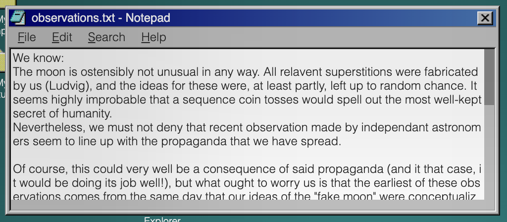 (This thing may LOOK harmless, but before you know it, it's chewed your hand off.)
The rust function for generating the notepad window(s) is 250 lines long, so it's safe to say I won't paste it in here. Words will have to do the trick.
Now, notice how I wrote "window(s)". This is because every text file gets its own notepad window, since we ideally want to allow the reader to open two text files at once. It should therefore be clear that the text content itself isn't the hard part. We simply iterate over the text files and, for each one, generate a window with its contents stuck inside a
.np-view {
    white-space: pre;
    overflow: scroll;
}div. Replicating the old-time-y scroll bars can be done with some simple styling:
.np-view::-webkit-scrollbar             { height: 10px; }
.np-view::-webkit-scrollbar:vertical    { width: 10px; }
.np-view::-webkit-scrollbar-track       { background: #C0C0C0; }
.np-view::-webkit-scrollbar-thumb       { background: #888; }
.np-view::-webkit-scrollbar-thumb:hover { background: #555; }
/* we place a small rectangle to patch the hole that otherwise appears where the scroll bars intersect*/
.np-main::after {
	content: "";
	width: 10px;
	height: 10px;
	background-color: #C0C0C0;
	display: block;
	position: absolute;
	bottom: 2px;
	right: 2px;
}
All in all, the html for the file contents looks like
<div class="window-main">
    <div class="np-main">
        <div class="np-view">
            <p>My awesome text file.</p>
        </div>
    </div>
</div>
BUT! It isn't that simple. We also need a Menubar! And this is where the Pain begins.
Are you ready? Take a deeep breath... And-
1. We need some buttons. Ok simple. Easy. BAM!
<div class="container">
    <div class="menubar menubar-short">
        <div class="menubar-item">
            <p>File</p>
        </div>
        <div class="menubar-item">
            <p>Edit</p>
        </div>
        <div class="menubar-item">
            <p>Search</p>
        </div>
        <div class="menubar-item">
            <p>Help</p>
        </div>
    </div>
</div>
*, *::before, *::after {
box-sizing: border-box;
margin: 0;
}
.container {
background: #C0C0C0;
color: black;
font-size: 12px;
}
.menubar {
padding: 1px;
display: flex;
height: 24px;
align-items: center;
}
.menubar.menubar-short {
height: 20px;
}
.menubar-item {
padding: 1px 7px;
}
.menubar-item {
border: 1px inset transparent;
position: relative;
}
.menubar-item:hover {
border: 1px inset rgb(238, 238, 238);
}They even look pretty when you hover them. Wow.
2. When we click on a button, we want to enter a special state where hovering any button on that menubar will reveal its submenu. When we click outside of this menu, or interact with an enabled button, we should exit the special state and hide any potentially open submenus.
For this, we add a .menubar-item-statediv inside each .menubar-item, along with a .mb-submenudiv . The .menubar-item-states start off hidden, but when a .menubar-item is clicked, they all appear in front of their sibling paragraph tag. We can then check for .menubar-item-state:hover to know when to reveal a submenu, and detect relevant clicks with :active to know when to hide the .menubar-item-states again.
<div class="container">
    <div class="menubar menubar-short">
        <div class="menubar-item">
            <div class="menubar-item-state"></div>
            <p>File</p>
            <div class="mb-submenu">
                <div class="mb-submenu-item">
                    <p>New</p>
                </div>
            </div>
        </div>
        <div class="menubar-item">
            <div class="menubar-item-state"></div>
            <p>Edit</p>
            <div class="mb-submenu">
                <div class="mb-submenu-item mb-disabled">
                    <p>Disabled button</p>
                </div>
            </div>
        </div>
        <div class="menubar-item">
            <div class="menubar-item-state"></div>
            <p>Search</p>
            <div class="mb-submenu">
                <div class="mb-submenu-item mb-disabled">
                    <p>Disabled button</p>
                </div>
            </div>
        </div>
        <div class="menubar-item">
            <div class="menubar-item-state"></div>
            <p>Help</p>
            <div class="mb-submenu">
                <div class="mb-submenu-item mb-disabled">
                    <p>Disabled button</p>
                </div>
            </div>
        </div>
    </div>
</div>
*, *::before, *::after {
box-sizing: border-box;
margin: 0;
}
.container {
background: #C0C0C0;
color: black;
font-size: 12px;
}
.menubar {
padding: 1px;
display: flex;
height: 24px;
align-items: center;
}
.menubar.menubar-short {
height: 20px;
}
.menubar-item {
padding: 1px 7px;
}
.menubar-item {
border: 1px inset transparent;
position: relative;
}
.menubar-item:hover {
border: 1px inset rgb(238, 238, 238);
}
.menubar-item-state:hover~.mb-submenu,
.mb-submenu:hover {
display: block;
}
.mb-submenu:has(.mb-submenu-item:not(.mb-disabled, details):active) {
display: none;
}
.menubar-item-state {
content: "";
position: absolute;
width: 100%;
height: 110%;
background-color: #00007B; opacity: 0.2; /* for demonstrational purposes*/
left: 0px;
top: -2000px;
transition: top 10s linear 2147483640s;
}
.menubar:has(.menubar-item:active) .menubar-item-state {
top: 0px;
transition: top 0s linear;
}
.menubar-item-state:hover {
/* background-color: green !important; */
}
/* In the original source code I wrote "i call this the bullshit selector. no i shall not explain it. my life is a mistake." */
/* This, more or less (I think there's a mistake somewhere in there), checks for when anything inside the body, except for certain items in the menubar, are clicked. */
body:is(:not(:has(.menubar-item-state:active), :has(.menubar-item:active)), :has(.mb-submenu-item:not(.mb-disabled, details):active)):active .menubar-item-state {
top: -2000.001px;
transition: top 0s linear;
}
.mb-submenu {
display: none;
position: absolute;
z-index: 3;
background-color: #C0C0C0;
min-width: 120px;
transform: translate(-8px, 2px);
padding: 1px;
border: 2px;
border-color: rgb(238, 238, 238);
border-style: groove;
}
.mb-submenu-item p {
margin-left: 16px;
padding: 2px 0;
padding-left: 5px;
white-space: nowrap;
margin-right: 16px;
}
.mb-disabled {
color: #87888E;
}
.mb-submenu-separator {
width: 100%;
margin: 3px 0;
padding: 0 1px;
}
.mb-submenu-separator::before {
content: "";
display: block;
width: 100%;
border-bottom: 2px;
border-bottom-color: rgb(238, 238, 238);
border-bottom-style: groove;
}
.mb-submenu-item:hover {
background-color: #0000A1;
color: white;
}Oh boy, but we're not done!
3. Some of the buttons should actually do something.
For the Notepad, I decided to implement
- File > Exit
- Edit > Word Wrap
- Help > About
- Edit > Set Font
For Exit, we can just slap a class on that sucker, check for .exitorwhatever:active and move the parent window out of bounds, effectively "closing" it. We also do some other stuff, but we'll get to that later.
Word Wrap is also quite easy. This is, in fact, one of the few places where using details elements is actually beneficial. We can just add a
<details class="mb-submenu-item mb-submenu-item-SOMETHING_UNIQUE">
    <summary>
        <p>Word Wrap</p>
    </summary>
</details>
with some
.mb-submenu-item[open] summary::before {
	content: "";
	width: 9px;
	height: 9px;
	display: block;
	background-image: url("CHECKMARK");
	background-size: cover;
	position: absolute;
	transform: translate(5px, 3px);
}
a
.mb-submenu-item[open]:hover summary::before {
	filter: invert(100%);
}
If you noticed details elements being mentioned in the css of the previous demo, this is because I decided to not close the submenu when toggling a checkbox, since that is Annoying. We can then query the state of the details element to conditionally apply some css:
.window-SOME_ID:has(.mb-submenu-item-SOMETHING_UNIQUE[open]) .np-view {
    white-space: pre-wrap;
    word-break: break-all;
}
Okay. Not too bad.
For About, we simply open an error dialog saying that "Error: Could not locate Application Info", since I don't want to write a bunch of help pages. More on how dialogs function will be discussed later.
That brings us to Set Font. And I will tell you: This was NOT FUN.
When clicked, the Set Font button opens a corresponding (per-notepad-window) font selector window. (By "opening" I naturally mean moving the aforementioned window into bounds so that it can be seen - and other stuff :tm:).
Let us begin with the font size. Implementing it is pretty elementary. We check for when a certain font size is :active, and set the font size of the notepad window (using transitions of course). The reason we use transitions is because ao3 doesn't let us name our details elements, which means we cannot link them together so that, when one is opened, the others with the same name close. Of course, this means we have to set an initial font-size of something like 12.01px, to work around transition nonsense.
Next, we have the font. Easy enough. Just apply transitions to the font-family property (you will probably need transition-behavior: allow-discrete;), while duplicating one of the font families for the default font (i.e. writing font-family: sans-serif, sans-serif;) to avoid the aforementioned nonsense.
Lastly we have the font style. Oh boy. There is a good chance that this problem has an obvious solution that I did not discover. If it does, then feel free to publicly embarrass me publicly. But... From what I know, there are only three valid values for font-style: normal, italic, and oblique (with an optional angle). Most fonts render oblique XYZdeg like italic (regardless of the angle) (except for 0deg and other small values, which I think the browser just equates to font-style: normal;). And so, if we want to start off with unitalicized text, the default value of font-style needs to be normal.
But then, because of transition nonsense, we can never transition back to normal after transitioning away!!
<button class="A">Normal</button>
<button class="B">Italic</button>
<button class="C">Oblique</button>

<p>FOOO</p>
p {
  font-style: normal;
  transition: font-style 0s linear 10000s;
  transition-behavior: allow-discrete;
}

.A:active ~ p {
  transition: 0s;
  font-style: normal;
}

.B:active ~ p {
  transition: 0s;
  font-style: italic;
}

.C:active ~ p {
  transition: 0s;
  font-style: oblique;
}
And, remember, oblique: 0deg is equivalent to normal, so using that has the same issue! (at least on chrome and firefox (as of May 2026). I have no idea how this works in other browsers)
The only solution is to start off with oblique: 1deg (or any value >1). This works, because oblique is different from italic. But now, every text document starts off being italicized!
What we would need is to apply font-style: normal; temporarily (since if this declaration is still active by the time the reader is messing with the font selector, they might get stuck with italics), preferably right after the page has loaded. To solve this, we can introduce a div with the .onload class. This div should sit above all Windows98y content and, when hovered:
- disappear so that the user can interact with the page,
- apply
font-style: normal;and other similar declarations.
Okay. That was a lot. If you want to play around with all of this, then I recommend visiting windows9ao3 and opening a text file, since it amounts to A Lot of code that I don't want to port to a different environment.
Finally we can move on...
...though if you'll indulge me for a moment, I quite like the API I made for building the menubars. (Warning: raw rust code)
The fact that I was able to make so many things interactive as I did is, in part, thanks to the many messy but efficient tools that I wrote for quickly emitting html and css. This one in particular is contained in a ~200 LoC file, though most of that is boilerplate for setting up the "Builder Pattern" (if you're feeling extra pretentious). In reality, the codegen is only 63 LoC long, which is a small price to pay for the many lines of code that were saved from using the MenubarBuilder. So, if you're making something similar to this (or just... anything... in general), you should make small helper functions/structs/whatevers. It makes you significantly less miserable.
MenubarBuilder. So, if you're making something similar to this (or just... anything... in general), you should make small helper functions/structs/whatevers. It makes you significantly less miserable.MenubarBuilder::new()
.short(true)
.item("File", |item| {
item.group(|group| {
group
.sub_disabled("New")
.sub_disabled("Open...")
.sub_disabled("Save")
.sub_disabled("Save As...")
})
.group(|group| {
group.sub_disabled("Page Setup...").sub_disabled("Print")
})
.group(|group| group.sub("Exit", |i| i.action(Action::Close(id))))
})
.item("Edit", |item| {
item.group(|group| group.sub_disabled("Undo"))
.group(|group| {
group
.sub_disabled("Cut")
.sub_disabled("Copy")
.sub_disabled("Paste")
.sub_disabled("Delete")
})
.group(|group| {
group.sub_disabled("Select All").sub_disabled("Time/Date")
})
.group(|group| {
group
.sub("Word Wrap", |i| {
i.html_toggle().id(word_wrap_toggle_id)
})
.sub("Set Font", |i| i.action(Action::Open(font_id)))
})
})
.item("Search", |item| {
item.group(|group| {
group.sub_disabled("Find...").sub_disabled("Find Next")
})
})
.item("Help", |item| {
item.group(|group| group.sub_disabled("Help Topics")).group(
|group| group.sub("About", |i| i.dummy().id("about".hashed())),
)
})
.build(html, css, self);
MenubarBuilder::new()
    .short(true)
    .item("File", |item| {
        item.group(|group| {
            group
                .sub_disabled("New")
                .sub_disabled("Open...")
                .sub_disabled("Save")
                .sub_disabled("Save As...")
        })
        .group(|group| {
            group.sub_disabled("Page Setup...").sub_disabled("Print")
        })
        .group(|group| group.sub("Exit", |i| i.action(Action::Close(id))))
    })
    .item("Edit", |item| {
        item.group(|group| group.sub_disabled("Undo"))
            .group(|group| {
                group
                    .sub_disabled("Cut")
                    .sub_disabled("Copy")
                    .sub_disabled("Paste")
                    .sub_disabled("Delete")
            })
            .group(|group| {
                group.sub_disabled("Select All").sub_disabled("Time/Date")
            })
            .group(|group| {
                group
                    .sub("Word Wrap", |i| {
                        i.html_toggle().id(word_wrap_toggle_id)
                    })
                    .sub("Set Font", |i| i.action(Action::Open(font_id)))
            })
    })
    .item("Search", |item| {
        item.group(|group| {
            group.sub_disabled("Find...").sub_disabled("Find Next")
        })
    })
    .item("Help", |item| {
        item.group(|group| group.sub_disabled("Help Topics")).group(
            |group| group.sub("About", |i| i.dummy().id("about".hashed())),
        )
    })
    .build(html, css, self);
File Explorer
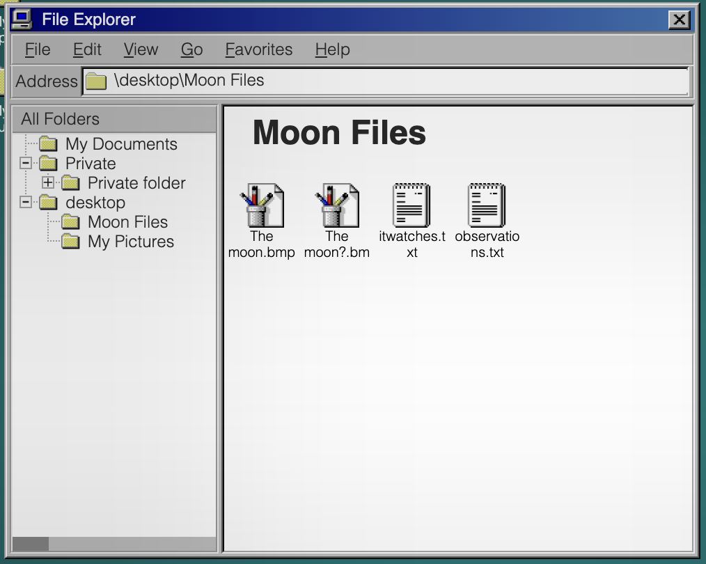
If we take a quick look at File Explorer as appears in windows9ao3, it looks quite complicated. But this time I promise it's actually simple for realz 100%. (All of the complicated stuff went into creating the dotted lines between folders on the left sidebar, which I will be pretending don't exist for the sake of my sanity.)
The window can be split up into four parts.
The Menubar
We just covered this. Apart from the Exit and About buttons, which do the same things as for the Notepad window, none of the buttons have any effects.
The Address Bar
We just display the path of the current file. This is done by absolutely positioning a bunch of paragraph tags, and changing which one is displayed whenever the reader clicks on a folder anywhere. We only have a single File Explorer window, so regardless of if the reader clicks on a folder on the desktop or in the File Explorer, we do the same thing. (of course, transitions are used to ensure that state is preserved)
The Right Panel
This is just the desktop but with a white background and using display: flex for positioning items instead of position: absolute; left: .... The previously mentioned emit_file_view_content function is used here.
There is also a small section between the two panels which can be dragged to resize them. This is done much like how resizing windows is done. We have two large divs that appear when dragging, and when hovered they resize the panels (either to the left or to the right depending on which panel is hovered).
The Left Panel
Finally we have the folder tree. As one may expect, the html matches this structure. Before looking at an example, I should warn you that the class names I picked here are among the worst in the entire project.
- fe-sideview-view = file explorer sideview view, ie the left panel
- fe-svv-child = a group of folders on the same depth
- fe-svv-item = a folder (fe-svvi-group) and its contents (fe-svv-child)
- fe-svvi-group = an actual folder
- fe-svvi-expander = the small '+' or '-' icon next to a folder. there are two of these (a '+' and a '-'), and which one is displayed depends on if the directory is open or closed in the panel
- fe-svvi-name = the folder name
- desktop-item-double-clicker, desktop-item-animator, and desktop-item-animator-helper = helpers for double clicking on folder to open it. these function much like they do for desktop items (i am reusing the same classes, which is why they have 'desktop' in their names, even though this has nothing to do with the desktop)
- the fe-svv-child-XYZ etc classes are used to hide/show the contents of specific folders
<div class="fe-sideview-view">
    <div class="fe-svv-child fe-svv-child-13646096770106105413">
        <div class="fe-svv-item">
            <div class="fe-svvi-group ">
                <div class="fe-svvi-expander fe-svvi-expander-open"></div>
                <div class="fe-svvi-expander fe-svvi-expander-close"></div>
                <div class="fe-svvi-name fe-svvi-name-1210529029120455773">
                    <p>My Documents</p>
                    <div class="desktop-item-double-clicker"></div>
                </div>
                <div class="desktop-item-animator">
                    <div class="desktop-item-animator-helper"></div>
                </div>
            </div>
            <div class="fe-svv-child fe-svv-child-1210529029120455773"></div>
        </div>
        <div class="fe-svv-item">
            <div class="fe-svvi-group fe-svv-expandable">
                <div class="fe-svvi-expander fe-svvi-expander-open"></div>
                <div class="fe-svvi-expander fe-svvi-expander-close"></div>
                <div class="fe-svvi-name fe-svvi-name-11554475998122298575">
                    <p>Private</p>
                    <div class="desktop-item-double-clicker"></div>
                </div>
                <div class="desktop-item-animator">
                    <div class="desktop-item-animator-helper"></div>
                </div>
            </div>
            <div class="fe-svv-child fe-svv-child-11554475998122298575">
                <div class="fe-svv-item">
                    <div class="fe-svvi-group ">
                        <div class="fe-svvi-expander fe-svvi-expander-open"></div>
                        <div class="fe-svvi-expander fe-svvi-expander-close"></div>
                        <div class="fe-svvi-name fe-svvi-name-14808982151169496954">
                            <p>Private folder</p>
                            <div class="desktop-item-double-clicker"></div>
                        </div>
                        <div class="desktop-item-animator">
                            <div class="desktop-item-animator-helper"></div>
                        </div>
                    </div>
                    <div class="fe-svv-child fe-svv-child-14808982151169496954"></div>
                </div>
            </div>
        </div>
    </div>
</div>
(a simplified version of the left panel in the file explorer in windows9ao3)
When it comes to opening folders, there are two kinds of "opening" at play. There is the standard kind - double clicking on a folder on the desktop, in the right panel, or on a folder name in the left panel. This will expand the corresponding .fe-svv-item in the left panel, open the folder in the right panel, and update the address bar.
Then there is the "special" kind of opening. When we click on an .fe-svvi-expander, we expand the corresponding .fe-svv-item, but do nothing else. This (as far as I know) pretty much replicates the behaviour of Windows98.
I won't go into too much detail, but we pretty much just have to hide/show specific elements whenever the user interacts with certain other elements. Something along the lines of
.main:has(.desktop-item-SOME_UNIQUE_ID + .desktop-item-animator .desktop-item-animator-helper:hover) .fe-sideview-view .fe-svv-child:is(:has(.fe-svv-child-SOME_CORRESPONDING_ID), .fe-svv-child-SOME_CORRESPONDING_ID) {
    height: 100%;
    transition: 0s;
}
Here we check if the reader double-clicks a folder (on the desktop or right panel) tagged with SOME_UNIQUE_ID. If so, we display its children (in the left panel) along with uncollapsing its parents (in case the user has collapsed the folder which contains it (again, in the left panel)). Of course, we need to link together every possible way to open a file with everything that opening a file has to accomplish, but this isn't more difficult than adding a few slightly modified copies of the above css.
Clock
No operating system is complete without a clock. There are a lot of ways to implement one, and I have to admit that I probably chose one of the least practical ones. You could, for instance, add a long transition to a clock hand and then, on .onload:hover, "wind it up".
<div class="onload"></div>
<div class="clock">
    <div class="second-hand"></div>
</div>
.clock {
background: #C0C0C0;
width: 100px;
height: 100px;
position: relative;
}
.second-hand {
outline: 1px solid black;
width: 0px;
height: 40px;
position: absolute;
bottom: 50%;
left: 50%;
/* we of course would not use calc in ao3, since it is unsupported */
transition: transform calc(10000 * 60s) linear;
transform-origin: bottom;
}
body:has(.onload:hover) .second-hand {
transition: 0s;
transform: rotate(calc(-360deg * 10000));
}
.onload {
position: absolute;
inset: 0;
transition: z-index 0s linear 10000000000s;
background: green;
opacity: 0.2;
z-index: 0;
}
.onload:hover {
transition: 0s;
z-index: -1;
}If we add the minute and hour hands, we can get a convincing result:
<div class="onload"></div>
<div class="clock">
    <div class="hand second-hand"></div>
    <div class="hand minute-hand"></div>
    <div class="hand hour-hand"></div>
</div>
body {
--speed-mult: 10;
}
.clock {
background: #C0C0C0;
width: 100px;
height: 100px;
position: relative;
}
.hand {
position: absolute;
width: 0px;
bottom: 50%;
left: 50%;
transform-origin: bottom;
}
.second-hand {
outline: 1px solid red;
height: 48px;
transition: transform calc(10000 * 60s / var(--speed-mult)) linear;
}
.minute-hand {
outline: 1px solid green;
height: 40px;
transition: transform calc(10000 * 60 * 60s / var(--speed-mult)) linear;
}
.hour-hand {
outline: 1.5px solid blue;
height: 30px;
transition: transform calc(10000 * 12 * 60 * 60s / var(--speed-mult)) linear;
}
body:has(.onload:hover) .hand {
transition: 0s;
transform: rotate(calc(-360deg * 10000));
}
.onload {
position: absolute;
inset: 0;
transition: z-index 0s linear 10000000000s;
background: green;
opacity: 0.2;
z-index: 0;
}
.onload:hover {
transition: 0s;
z-index: -1;
}(sped up for presentational purposes. feel free to change the --speed-mult variable)
Alternatively, we could stick this inside an svg. These have some nasty drawbacks, as ao3 requires us to stick them inside <img> tags (for instance, we have to include "external" images using data:... urls). Nonetheless, svgs allow us to use css animations, which could be used to create any number of clocks in infinitely many ways.
This was, however not what I did. I did something much stupider. You see, I wanted to have a live updating clock in the taskbar (of the format hour-hour:minute-minute, e.g. 06:32). This could, much like the clock hands themselves, have been done using svgs or probably just normal transitions. But, for some reason I can no longer remember, I decided the best approach was to have a full screen div - much like .onload - pop up every minute. This div then contains several more divs, one for each minute in the hour. When one of these (the one with the highest z-index) is hovered, the program
- hides all of these
divs again (for 60 seconds) - ensures that the
divcorresponding to the next minute is given the highest z-index (i.e. if "minute 4" was in front and was hovered, "minute 5" would be placed in front (to be hovered next time)) - advances the minute hand to the next minute
- resets the second hand
- advances the state of the taskbar clock ("06:58" -> "06:59")
Instead of moving independently, all of the clock hands are thus controlled by this system. The second hand is set to rotate only one rotation in 60 seconds - and stops right as it is reset (you can see this in the form of a small stutter in its movement at the end of every minute in the finished product).
Of course, some more logic is required to handle the end of every hour, but I don't want to recite that... This is bad enough as it is.
Admittedly, this approach ensures that time is always in sync across the program. The downside is a lot of unnecessary complexity. Additionally, the clock system will get stuck at the start of each new minute unless the reader is hovering the page, but this is more or less unnoticeable.
Okay, that's enough transitions for a while. Let's do something else. Something... related to fanfiction?
Dialogs... And Vendor-Specific-CSS Abuse
"Surely no one would want to style the contents of the <audio> element," said the CSS Working Group.
"Noooo, please, I need that," I responded
"Hey kid... I have some... cough cough ...'css' 'enhancing' 'substances'. Just follow me into this dark alley," the webkit maintainers whispered from the shadows
Okay no I lied this is not related to fanfiction.
But fear not; it's related to something even greater: The <audio> element!
Have you ever wanted to play a sound whenever the reader clicks something in a fic. Yes? No? I don't care. Big Dirty AO3 has tried to prevent us from doing such things, by restricting us to using the browser's built in audio player.
When implementing dialogs, I wanted to play a ding whenever the user tried interacting with anything outside of the dialog (because windows98 does that). Displaying the dialog is simple enough: Just open a window with a high z-index and place a large div behind it so that you can't interact with other applications.
<button>CLICK HERE TO WIN BITCOIN!! <br>INFuSED WITH AI TECHNOLOGY <sup>for only $44.99</sup></button>
<div class="dialog">
    <div class="cover"></div>
    <div class="window">
        <p class="fan-ta-dig-jävla-fuckare">Oh no there is an annoying dialog in the way. oh no...</p>
    </div>
</div>
.dialog {
position: absolute;
left: 100px;
top: 100px;
width: 200px;
height: 100px;
}
.window {
background: #C0C0C0;
position: absolute;
inset: 0;
}
.cover {
position: absolute;
inset: -10000vw;
background: blue;
opacity: 0.2;
}
sup {
opacity: 0.2;
}
button:hover {
background: red;
}But we have no sound :(
So how about we try one of these audio elements? (Warning: the rest of this section next part may not work depending on which browser you use. I mean, the same goes for this entire article, so if you got this far then you should be fine)
<!-- the `controls` attribute makes the element visible and interactable -->
<audio src="/static/audio/ding.wav" controls></audio>
If we wanted to play this whenever the user clicked outside the dialog, a natural idea is to make the audio element reeeaaaaaaaalllyyy big (and stick it in the .coverdiv ).
<audio src="/static/audio/ding.wav" controls></audio>
audio {
    transform: scale(10000);
    transform-origin: 24px 24px;
}
This works great in chrome. And it even happened to work in firefox. But... this is very reliant on the exact layout of the browser's native audio element. If the play button is not, say, offset roughly 24px (in both x and y) from the top left of the element then... Well then we're slightly fucked. Also this approach is boring and I don't like it.
Introducing: vendor-specific pseudo-classes. If you're using the right browser then you may have access to selectors like audio::-webkit-media-controls-play-button and audio::-webkit-media-controls-enclosure. These can be used to apply styles to the internal "shadow-dom" (or something, I don't read documentation) of the audio element. You should be able to view this in your browser's dev tools (if your browser is chrome).
By abusing these pseudo-classes, we can simply make the play button really big on its own (and also remove the pesky cursor: pointer that the browser snuck in).
<audio src="/static/audio/ding.wav" controls></audio>
audio {
    position: absolute;
    left: -50%;
    top: -50%;
    width: 200%;
    height: 200%;
}
audio::-webkit-media-controls-play-button {
    transform: scale(1000000) !important;
    z-index: 1000 !important;
    cursor: default !important;
}
audio::-webkit-media-controls-enclosure {
    max-height: unset !important;
    height: 100% !important;
}
This also happens to work in safari and firefox, as they seem to treat any click on an audio element that does not interact with one of its many buttons and sliders as if the user had clicked on the play button - something which chrome doesn't seem to do.
After setting opacity: 0 on the whole thing, we have a functioning dinger.
<button>CLICK HERE TO WIN BITCOIN!! <br>INFuSED WITH AI TECHNOLOGY <sup>for only $44.99</sup></button>
<div class="dialog">
    <div class="cover">
    <audio src="/static/audio/ding.wav" controls></audio>
    </div>
    <div class="window">
        <p class="fan-ta-dig-jävla-fuckare">Oh no there is an annoying dialog in the way. oh no...</p>
    </div>
</div>
.dialog {
position: absolute;
left: 100px;
top: 100px;
width: 200px;
height: 100px;
}
.window {
background: #C0C0C0;
position: absolute;
inset: 0;
}
.cover {
position: absolute;
inset: -10000vw;
background: blue;
opacity: 0;
}
sup {
opacity: 0.2;
}
button:hover {
background: red;
}
audio {
position: absolute;
left: -50%;
top: -50%;
width: 200%;
height: 200%;
opacity: 0;
}
audio::-webkit-media-controls-play-button {
transform: scale(1000000) !important;
z-index: 1000 !important;
cursor: default !important;
}
audio::-webkit-media-controls-enclosure {
max-height: unset !important;
height: 100% !important;
}Which works in chrome, safari, and firefox! Of course, if the reader clicks on the audio element again, before it has finished playing, we have some issues - but the audio clip is short enough for it to be more or less unnoticeable. I invite you to figure out a better way of doing this - and to jump through the hoops required to prevent pausing the audio before it is finished.
Linking It Together with Casual Oxidization
Now that we have a decent amount of Windows98-like components, it is high time to figure out how to put the pieces together. Attentive readers may have noticed that I'm using the rust programming language for this task (i.e. to generate html and css programmatically). So before we cover this, I think it is a good idea to give a small introduction to rust so that my terrible code is at least somewhat comprehensible.
Basic Rust
I am assuming that any reader that has gotten this far knows their way around javascript or python or idk c or c# etc (I will not be explaining what a function is).
// this is a function
fn my_function() {

}
// this function returns a 32 bit signed integer
fn number() -> i32 {
    return 69;
}
// if we omit the semi colon on the last statement in a function then its value is returned
fn number_but_shorter() -> i32 {
    69
}

// this is a struct, often called a class in other languages (they work basically the same). It can be debug-printed and cloned using `alice.clone();`. A person has a name which is a string and a woke gender which is an instance of the enum(eration) `WokeGender`
#[derive(Debug, Clone)]
struct Person {
    name: String,
    woke_gender: WokeGender,
}
// this is an enum. It can either be WokeGender::Mail, WokeGender::FemMail, WokeGender::TransedGonger, WokeGender::IckeBinaer, or WokeGender::Other(xyz) where xyz is an arbitrary string.
#[derive(Debug, Clone)]
enum WokeGender {
    Mail,
    FemMail,
    TransedGonger,
    IckeBinaer,
    Other(String),
}

fn a_small_program() {
    let person = Person {
        name: "Alice".into(), // we use .into() to convert from a &str to a String. Don't worry about this.
        woke_gender: WokeGender::Mail,
    };
    // bob is mut(able); we can change his gender
    let mut bob = Person {
        name: "Bob".into(),
        woke_gender: WokeGender::Other("woke".into()),
    };
    bob.woke_gender = WokeGender::Other("woker".into());
    // we create a "vector" of people. Lists/Arrays are called vectors in rust-- deal with it.
    let list_of_people /* has type Vec<Person> */ = vec![
        person, bob
    ];
    // we give the function a "borrow" of our list, since the list is OURs and the EVIL fucntion CAN'T HAVE IT!! This is done through the '&'
    print_people(&list_of_people);
}
fn print_people(borrowed_list_of_people: /*we accept a "borrow" of the list*/ &Vec<Person>) {
    for person in borrowed_list_of_people.iter() {
        // this is how you deal with enums
        match person.woke_gender {
            WokeGender::Mail => println!("{} is way to mail", person.name),
            WokeGender::FemMail => println!("{} is literally actually a fem", person.name),
            _ => println!("{} is some other kind of woke freak", person.name),
        }
    }
}
(This was mostly an excuse for me to write about the EVIL frfr woke agenda in my very serious conservative christian minecraft blog 100% frfr)
Emitting HTML and CSS
Writing out html and css by hand, when you have several hundred kilobytes of each, will decrease your life expectancy by at least ten years. To remedy this, I wrote the following functions for quickly emitting html elements:
// this function accepts an `html_buffer` to write into, as a mutable borrow of a String. This means that the function can write into a string owned by the caller.
// we also accept a `function_that_fills_the_div_with_content`, which lets the caller specify their own content
fn emit_div(html_buffer: &mut String, class: &str, mut function_that_fills_the_div_with_content: impl FnMut(&mut String)) {
    html_buffer.push_str(
        // simple string formatting.
        &format!(r##"<div class="{class}">"##)
    );
    function_that_fills_the_div_with_content(html_buffer);
    html_buffer.push_str(&format!(r##"</div>"##));
}
fn emit_p(html_buffer: &mut String, class: &str, content: &str) {
    html_buffer.push_str(&format!(r##"<p class="{class}">{content}</p>"##));
}
fn emit_img(html_buffer: &mut String, class: &str, src: &str) {
    html_buffer.push_str(&format!(r##"<img class="{class}" src="{src}" />"##));
}
These functions are then used almost everywhere in the codebase. For instance, the Quick View application (the image viewer, which is just a glorified <div class="window"><img src="someimage.png"></div>) has code that looks something like
// ... code for emitting the outer window div (which contains a bunch of unreadable bullshit relating to window dragging) is not included
emit_div(html, "window-main window-main-nopadtop", |html| {
    emit_div(html, "qv-main", |html| {
        emit_div(html, "qv-view border-style-dark-1", |html| {
            // we emit a seperate window for every image file. `file` refers to the window's corresponding file.
            let res_name = file.link.strip_prefix("img/").unwrap();
            // a special syntax is used for the image src (`@img:someimage.png`). this is later replaced with either a local path (`/res/img/someimage.png`), or a github pages link (wao3.taxen99.github.io/SOME_UNIQUE_ID.png), depending on whether we're developing locally or deploying to ao3
            let image_src = format!("@img:{res_name}");
            emit_img(html, "", &image_src);
        });
    })
});
// ...
If you're going to do any sort of complex ao3 html development, then I implore you to do something similar to this. You naturally don't have to use rust (in fact, you probably shouldn't). And you could even go for a hybrid-approach, where you write raw html and css, but use some "magic syntax" that you then replace with valid html using a script. I did something like this for a certain fic where I needed a lot of footnotes, allowing me to write my html like this
<div class="section">
    <p>Woah this is such amazing literature really 100% Oh look a footnote[44]!</p>
    <div class="footnotes">
        <p>[decl44]FUCK I PRESSED CMD-H instead of CMD-I FUCK MY WINDOW DISAPPEARED. oh there it is [ret44]</p>
    </div>
</div>
and have it be transformed (with some disgusting regexes) into
<div class="section">
    <p>Woah this is such amazing literature really 100% Oh look a footnote<sup><a href="#48" name="ret48" id="ret48">48</a></sup>!</p>
    <div class="footnotes">
        <p><sup><a name="44" id="44" class="footdecl">44</a></sup>FUCK I PRESSED CMD-H instead of CMD-I FUCK MY WINDOW DISAPPEARED. oh there it is <sup><a href="#ret44">[ret]</a></sup></p>
    </div>
</div>
(this is really ugly and no one wants to write this monstrosity for 50 footnotes.)
Actions
Apart from writing vast amounts of repetitive html very quickly, scripting can also be used to write vast amounts of repetitive css very quickly. I know - Crazy.
In windows9ao3, this is done mostly through an Actions system. Basically, I define an Action to be
pub enum Action {
    Close(u64 /*window id*/),
    Open(u64 /*window id*/),
    OpenDialog(u64 /*dialog id*/),
    Focus(u64 /*window id*/),
    OpenFileExplorer(u64 /*file id*/),
}
And then an action can be emitted with
// let css = ...
let condition = ".SOME_CLASS:active";
let window_id = 69420;
self.emit_action(css, &Action::Open(window_id), condition);
which will roughly expand to
.main:has(.SOME_CLASS:active) .window-69420 {
    transition: 0s;
    top: 30px;
    left: 30px;
}
Though I think it's time to finally stop skirting around the exact details of how windows etc work.
What's actually going on frfr when you click an icon??? Magic???
Open
Say we have a window with the id 69 (this amounts to the outermost div that makes up the window having the class .window-69). This window can contain a specific application like the Clock or the File Explorer, or alternatively be an instance of the Notepad for a specific text file (or Quick View for an image file). No matter the type of the window, and regardless of how it was opened, a Action::Open(69) is triggered, which also triggers a Action::Focus(69).
The Open action will apply the following rules:
.window-69 {
    /* no `transition: 0s;` is set here since that's already done in the Focus action */
    top: 30px;
    left: 30px;
}
/* we make the window visible in the taskbar by changing its max-width from 0px to 160px */
.tb-app-69 {
    max-width: 160px;
    transition: 0s;
}
(where by "apply" I mean that .main:has(something-that-indicates-that-the-window-should-be-opened:hover) is prepended to every rule)
Notice how we add the window to the taskbar, which appears at the bottom of the screen.

If the window's id matches a select list of "quick launch apps" (set to be the File Explorer & Internet Explorer in windows9ao3) - which appear between the start button and the row of open applications, then we also ensure that the window is set to be open in the "quick launch bar". This is done by having two copies of every supported window's icon; when one of the windows is opened, the copy corresponding to the open state is placed in front, and vice versa.
/* this is named .tb-ql-item-*close*-69 (taskbar-quicklaunch-item-close-69) because clicking on it closes the window again */
.tb-ql-item-close-69 {
    transition: 0s;
    z-index: 2;
}
Close
This is simple enough:
.window-69 {
    /* we have no Focus action to set the transition for us, so we have to do it here this time */
    transition: top 0s linear 0s, left 0s linear 0s !important;
    /* funky decimals because of previously mentioned transition nonsense */
    top: 0.002px;
    left: -2000.002px;
}
.tb-app-69 {
    max-width: 0px;
    transition: 0s;
}
And for quick launch apps:
.tb-ql-item-close-69 {
    transition: 0s;
    z-index: -2;
}
OpenDialog
For this action, we also emit a Focus like how we do for Open. Since dialogs don't appear in the taskbar, all we need is
/* this of course assumes that window 69 is a dialog */
.window-69 {
    /* more or less the center of the screen */
    top: 295px;
    left: 403px;
}
Focus, oh boy oh no oh no no no no !
Take a deep breath again...
Okay.
1. When a window is focused, it should appear in front of other windows. This can easily be done by setting ensuring that windows have a base z-index transition
/* base code for the window class */
.window {
    /* we have left and top here for window movement, but also z-index for window z-ordering */
	transition: left 10s linear 2147483640s, top 10s linear 2147483640s, z-index 10s linear 2147483640s;
}
Then when a window gains focus we set
/* extra .window:s are here for selector specificity. This was required for some reason that I've forgotten */
.window-69.window.window {
    transition: 0s;
    z-index: 2147483640;
}
.window:not(.window-69).window.window {
    z-index: 1;
    transition: left 10s linear 2147483640s, top 10s linear 2147483640s, z-index /*This number is different:*/ 214748s linear;
}
Which moves window 69 to the front, while ensuring that the other windows gradually transition to a lower z-index. Every other window should move back roughly 2147483640/214748 (just about ten thousand) z-indices every second (a number which was chosen because it was the first thing I tried and it seemed to work), while maintaining their order relative to one another.
Because the other windows only move "backwards" when window 69 is being focused, a bug can occur if the reader taps window 69 for a short enough amount of time (proportional to the amount of css-induced lag that is present). In this case, the "backwards" transition doesn't have time to start properly; therefore the window that was previously in front will keep its z-index: 2147483640; and it will appear in front of the newly focused window 69 if it appears later in the html document.
A solution is (I think) to permanently keep the transition: z-index 214748s linear; enabled, thus ensuring that the previously focused window will have a z-index lower than 2147483640 by the time that window 69 is focused. I didn't do this because at the time I implemented this system, I was concerned about potential performance concerns - though I doubt this could make things worse than they already are.
2. Window titlebars should reflect their focused/unfocused state
Something something
.window-69.window.window .window-titlebar {
    background: linear-gradient(to right, #00007B, #3B79B8);
    transition: background 0s linear;
}
.window:not(.window-69).window.window .window-titlebar {
    background: linear-gradient(to right, rgb(126, 126, 125), rgb(187, 187, 187));
    transition: background 0s linear;
}
3. Finally, the taskbar should be updated to reflect the changes:
/* much like the "quick launch icons", every window in the toolbar has an focused and unfocused version. we simply change which one is in front*/
.tb-app-69 .tb-app-inner-active {
    transition: 0s;
    z-index: 1;
}
.tb-app:not(.tb-app-69) .tb-app-inner-active {
    transition: 0s;
    z-index: -1;
}
OpenFileExplorer
Let's now pretend that we have a folder with the id 420. Opening this folder in the file explorer is a matter of
1. Revealing the correct contents in the file explorer's right panel
.fe-view-420 {
    left: 0px;
    transition: left 0s linear !important;
}
.fe-view:not(.fe-view-420) {
    left: -20000.001px;
    transition: left 0s linear !important;
}
2. Opening the folder in the left panel.
.fe-sideview-view .fe-svv-child:is(:has(.fe-svv-child-420), .fe-svv-child-420) {
    height: 100%;
    transition: 0s;
}
.fe-sideview-view :is(.fe-svv-expandable:has(+ .fe-svv-child-420), .fe-svv-expandable:has(+ .fe-svv-child .fe-svv-child-420)) .fe-svvi-expander-open {
    transition: 0s;
    z-index: 1;
}
(this is messy enough that I don't feel inclined to explain it. more or less, we expand the folder 420 and any folder which contains this folder)
3. And of course we update the addressbar.
Any hey, here's an instance of me using the trick that I talked about with window focus. Every version of the addressbar (there is one for every folder that can be opened) constantly decreases its z-index at a consistent-ish rate. Then, when a folder is opened, we simply bring its addressbar to the front.
Sadly, this is also an instance of me being fucking stupid. Why did I do this??? There is no reason to ensure that the invisible addressbars keep their relative order to one another! Why didn't I just...... (Oh I just remembered why I did this; it's because I didn't want to add another rule for every folder (something like .fe-addrb:not(.fe-addrb-420) { hide-this-fucking-thing... }) - which is still stupid because I have like 5 folder in total!! which amount to a negligible mass of css...)
.fe-addrb-420 {
    transition: 0s;
    z-index: 2147483640;
}
Project Structure
(i am absolutely not procrastinating writing about the internet explorer what are you talking about?????)
Something I realize I never did when sharing the source code to this project is explain how to run it, beyond this gem of a message
"Unless you're a wizard, you'll probably not be able to actually run it, since images etc are missing7 (though the --deploy cli arg probably bypasses that), but it might be fun to look at, idk."
I figured it might be time to make up for that.
Running the code
The entry point of application is in src/bin/builder.rs, which corresponds to running $ cargo run --bin builder. Output files are written to output/index.html and output/index.css. Optionally, you can specify the following flags (you need to put -- before specifying any flags)
$ cargo run --bin builder -- --nobootbuilds the windows9ao3 without the boot sequence (which is very much recommended for debugging unless you want to go insane)$ cargo run --bin builder -- --deployadditionally outputsoutput/ao3.htmlandoutput/ao3.css. These files are compressed (for instance, css classes are shortened), and modified to work with ao3, versions of the correspondingindex.*files. As a part of this, images etc are copied into theao3-gitdirectory (which you need to create yourself!!) which is designed to be published as a repo on github to function as file hosting (note that I have hardcoded the github pages url to behttps://taxen99.github.io/wao3/*indeploy.rs).$ cargo run --bin builder -- --init WINDOW_IDopens the WINDOW_ID window on launch, where WINDOW_ID is some number (you can find the id of each window by looking at the code; notepad windows etc have ids corresponding to the hash of their file's path). For instance,--init 69opens the internet explorer on launch.
BUT!! Before you can do any of this, you have to run cargo run --bin image_upscaler, which creates higher resolution versions of several icons. Since ao3 doesn't support image-rendering: pixelated; yet, icons would look blurry without this. (I decided to upscale the images by a factor of nine (by which I mean I transform every pixel of the original image into a 9x9 grid of identical pixels in the output image), which was probably overkill...)
Where to find things
Since this was made frantically in roughly 50 days, things are not placed in any logical manner in the codebase. Almost all of the main logic is placed in src/config.rs, which is responsible for reading the config.ron file - containing the structure of the file system and the list of favorited pages in internet explorer - and generated most of the html and css. The files in the src/config directory define additional components for generating windows, menubars etc, and also the internet explorer.
All of the css is in src/bin/res/css.
The logic for the --deploy flag is in src/deploy.rs and src/deploy/. src/resource_resolver.rs contains my really shitty system for mapping a resource name - such as @img:crt.png - to either a local path or a github pages url, depending on whether we're generating index.html/css or ao3.html/css.
Finally, the html and css for all the websites are in res/sites/, where res/sites/fanfactions.net/ is a special case handled specifically by src/config/internet_explorer/fanfactions.rs.
Internet Explorer
This is the main attraction of windows9ao3.
- Flashy, modern (in 2001) website!
- Ads!!
- People's old fanfiction!!!
- And a working browser history!!!!
Let's start with the history
First, some constraints:
- By "history", I mean functional forward/back buttons that let you navigate between previously visited urls. While you could implement an actual browser history view (i.e. what you see when you press
Ctrl-Hor whatnot), I did not want to do this. - The history we'll be implementing can be thought of as consisting of two stacks. When a webpage is visited, we place it on the top of stack A, and clear the stack B. When we click the back button, we move the page on the top of stack A to the top of stack B. When we click the forward button, we move the page on the top of stack B back to the top of stack A.
- The "pages" we move between the two stacks will be represented by divs - one for each page. This means that each page can only appear once in the two stacks, so visiting a webpage will override its previous position in the history. This is a bit unfortunate, but I don't have any good ways to bypass this. Luckily, I think ought to be pretty rare, since it only occurs if the reader cycles back to a previously visited webpage.
Now how do we implement this??
Well, let's start with something a bit easier to visualize than a web browser.
<div class="main">
    <div class="onload"></div>
    <div class="cols">
        <div>
            <p class="history-trigger history-trigger-0">Goto 0</p>
            <p class="history-trigger history-trigger-1">Goto 1</p>
            <p class="history-trigger history-trigger-2">Goto 2</p>
            <p class="history-trigger history-trigger-3">Goto 3</p>
            <p class="history-trigger history-trigger-4">Goto 4</p>
            <p class="history-trigger history-trigger-5">Goto 5</p>

            <div class="button">
                <p class="history-back">go back</p>
            </div>
            <div class="button">
                <p class="history-forward">go forward</p>
            </div>
        </div>
        <div>
            <p class="i i0">Item 0</p>
            <p class="i i1">Item 1</p>
            <p class="i i2">Item 2</p>
            <p class="i i3">Item 3</p>
            <p class="i i4">Item 4</p>
            <p class="i i5">Item 5</p>
        </div>
    </div>
    <div class="history">
        <div class="history-items">
            <div class="history-none-back"></div>
            <div class="history-none-forward"></div>
            <div class="history-item history-item-0">
                <div class="history-item-reg"></div>
                <div class="history-item-move"></div>
                <div class="history-item-check-back"></div>
                <div class="history-item-check-forward"></div>
            </div>
            <div class="history-item history-item-1">
                <div class="history-item-reg"></div>
                <div class="history-item-move"></div>
                <div class="history-item-check-back"></div>
                <div class="history-item-check-forward"></div>
            </div>
            <div class="history-item history-item-2">
                <div class="history-item-reg"></div>
                <div class="history-item-move"></div>
                <div class="history-item-check-back"></div>
                <div class="history-item-check-forward"></div>
            </div>
            <div class="history-item history-item-3">
                <div class="history-item-reg"></div>
                <div class="history-item-move"></div>
                <div class="history-item-check-back"></div>
                <div class="history-item-check-forward"></div>
            </div>
            <div class="history-item history-item-4">
                <div class="history-item-reg"></div>
                <div class="history-item-move"></div>
                <div class="history-item-check-back"></div>
                <div class="history-item-check-forward"></div>
            </div>
            <div class="history-item history-item-5">
                <div class="history-item-reg"></div>
                <div class="history-item-move"></div>
                <div class="history-item-check-back"></div>
                <div class="history-item-check-forward"></div>
            </div>
        </div>
    </div>
</div>
.onload {
position: absolute;
inset: 0;
transition: scale 0s linear 10000000000s;
background: green;
opacity: 0.2;
scale: 1.0;
}
.onload:hover {
transition: 0s;
scale: 0.0;
}
.cols {
display: flex;
}
.i {
color: black;
transition: color 0s linear 9999999s;
}
.history {
position: absolute;
top: 0;
left: 0;
z-index: 2147483645;
}
.history-back:active, .history-forward:active {
transform: scale(0.0);
}
.history-back, .history-forward {
margin: 0;
}
.button {
height: 1.5lh;
}
.main:has(.onload:hover) .i0 {
color: red !important;
transition: 0s;
}Okay, what do we have here? The Goto X buttons are our "links", while the Item Xs represent the currently active webpage (When .onload is hovered, Item 1 should be red, while the rest remain black). Then we have the forward and backward buttons, which disappear when :active, which will allow us to later query their state using :active:hover and get a short pulse (instead of a continuous one until that lasts until the user releases their click).
Finally, we have the .history div, which contains the elements which will be placed in our two stacks - but that css hasn't been written yet.
Starting off with the .history div itself, we ideally want it to sit in front of everything else, since the entire history mechanism is driven by querying :hover on its children. However, we want any mouse events to pass through it while we're not shuffling items between our two stacks. The solution I use is to set a high z-index on the .history element, while also making it zero-sized. This way, we can move its contents off-screen while they're not in use and achieve the desired effect.
.history {
    position: absolute;
    top: 0;
    left: 0;
    z-index: 2147483645;
    /* the history element itself is a 0x0 div. is there a better way of doing this? probably, but this is what I came up with.  */
}
Now it's time for the hard part. (i would like you to know that i spend like an hour reading through my old css code, trying to remember what the hell i was doing, and mapping out the behaviour in a text file)
A way of visualizing what's going on is to think of the history items as 2 x 4 grids of 100vw x 100vh rectangles.
|             | MOVE        |
|             | REG         |
|             | CHECK BACK  |
| CHECK FORW. |             |
The rectangles with text in them correspond to the .history-item-reg, .history-item-move, .history-item-check-back and .history-item-check-forward divs, while the empty rectangles are... well... empty. These grid cells are positioned so that the top right corner of REG sits on the top right corner of .history-items(to clarify: .history-items is a 0 x 0 div, so technically all of its corners lie on the same point. all of its children simply overflow its bounds) . By shifting either the history item itself, or the outer .history-items div, these items can then be moved, changing which cell covers the viewport.
The .history-items div itself has two additional grid cells:
|             |             |
|             | NONE BACK   |
|             |             |
|             | NONE FORW.  |
which correspond to the history-none-back and history-none-forward. Similarly, we say that NONE BACK sits with its top right corner matching with the top right corner of .history-items.
By default, all history items sit behind these two outer cells in .history-items, the forward and backward buttons are disabled, the entire .history-items div is shifted down far outside the viewport, and Item 0 is selected.
Clicking links
Now let's say we press Goto 1. This shifts .history-items to the top right of the screen, while placing .history-item-1 at the top right of .history-items (in case it had been moved previously) and above everything else. This means that REG(1) (the REG of .history-item-1) covers the viewport. Finally, NONE FORW. is assigned an even higher z-index than .history-item-1.
When REG(1) is hovered, Item 1 becomes active instead of Item 0, and .history-items is shifted upward by 100vh. Now CHECK BACK(1) covers the viewport.
When CHECK BACK(1) is hovered, the backward button is enabled, and .history-items is shifted upward by another 100vh. Now NONE FORW. covers the viewport.
When NONE FORW. is hovered, the forward button is disabled, and .history-items is shifted back down far outside the viewport.
Clicking backward
If we then press the back button (which is now enabled), .history-items is moved back into view, and is shifted downward by 100vh. Now MOVE(X) covers the viewport, where X is the previously active "website" (would be 0 in this case).
When MOVE(X) is hovered, .history-items is shifted upward by 100vh and .history-item-X is moved 100vw to the right (and is now offscreen).
If there now exists a REG(Y) above NONE BACK, this occurs:
REG(Y) is hovered, and the same steps as above occur. The exception is the last step, because when .history-items is shifted upward by a total of 200vh, CHECK FORW.(X) will now be sitting in front of NONE FORW. and will thus be covering the viewport.
When CHECK FORW.(X) is hovered, the forward button is enabled, and .history-items is shifted back down far outside the viewport.
If instead, no REG(Y) exists above NONE BACK(this will be the case if we clicked Goto 1 and then the back button, as the only thing above NONE BACK would have been REG(1), which has been moved to the right) , then this happens:
NONE BACK is hovered, the backward button is disabled, the default "website" of 0 is activated, and .history-items is shifted downward 200vh. After this, CHECK FORW.(X) is hovered in the same way as before.
Clicking forward
If we then press the back button (which is now enabled), .history-items is moved back into view, and is shifted left by 100vw. Now REG(X) covers the viewport, where X is the previously active "website" (would be 1 if we're following the steps above).
When REG(X) is hovered, we go through the same steps as before. (Note that .history-items is shifted back right by 100vw). Also note that .history-item-X is brought to the front (this always happens when REG(X) is hovered, but it was not relevant to mention it before).
After this CHECK BACK(X) is hovered (see above).
Finally, if there exists a CHECK FORW.(Y) above NONE FORW. (i.e. we have another website we could go "forward" to), it will be hovered, producing the same result as above.
Else, NONE FORW. is hovered - again, producing the same result as previously mentioned.
...
And that's the history. The aforementioned two stacks (A and B) consist of the .history-items that are unshifted and those that are shifted to the right respectively. When "clearing" stack B after clicking a link (i.e. saying that we no longer have any pages to jump forward to), what we're actually doing is increasing the z-index of NONE FORW. so that it sits in front of the CHECK FORW.s of the items in stack B, resulting in us disabling the forward button.
To add to this, the .history-items and NONE FORW. both have a transition-duration of 214748s for the z-index property, meaning that they move continuously backward. This means that we can "bring an element to the front" without it ending up having the same high z-index as all the other elements "in the front" (see: discussion of window focus).
Also, I am lying ever so slightly in this description. There are some small differences between what I've described and the actual css that is used. Mostly, this is because the css is a bit messy and does some very, uh... interesting things at times.
With that said - here is the finished product:
<div class="main">
    <div class="onload"></div>
    <div class="cols">
        <div>
            <p class="history-trigger history-trigger-0">Goto 0</p>
            <p class="history-trigger history-trigger-1">Goto 1</p>
            <p class="history-trigger history-trigger-2">Goto 2</p>
            <p class="history-trigger history-trigger-3">Goto 3</p>
            <p class="history-trigger history-trigger-4">Goto 4</p>
            <p class="history-trigger history-trigger-5">Goto 5</p>

            <div class="button">
                <p class="history-back">go back</p>
            </div>
            <div class="button">
                <p class="history-forward">go forward</p>
            </div>
        </div>
        <div>
            <p class="i i0">Item 0</p>
            <p class="i i1">Item 1</p>
            <p class="i i2">Item 2</p>
            <p class="i i3">Item 3</p>
            <p class="i i4">Item 4</p>
            <p class="i i5">Item 5</p>
        </div>
    </div>
    <div class="history">
        <div class="history-items">
            <div class="history-none-back"></div>
            <div class="history-none-forward"></div>
            <div class="history-item history-item-0">
                <div class="history-item-reg"></div>
                <div class="history-item-move"></div>
                <div class="history-item-check-back"></div>
                <div class="history-item-check-forward"></div>
            </div>
            <div class="history-item history-item-1">
                <div class="history-item-reg"></div>
                <div class="history-item-move"></div>
                <div class="history-item-check-back"></div>
                <div class="history-item-check-forward"></div>
            </div>
            <div class="history-item history-item-2">
                <div class="history-item-reg"></div>
                <div class="history-item-move"></div>
                <div class="history-item-check-back"></div>
                <div class="history-item-check-forward"></div>
            </div>
            <div class="history-item history-item-3">
                <div class="history-item-reg"></div>
                <div class="history-item-move"></div>
                <div class="history-item-check-back"></div>
                <div class="history-item-check-forward"></div>
            </div>
            <div class="history-item history-item-4">
                <div class="history-item-reg"></div>
                <div class="history-item-move"></div>
                <div class="history-item-check-back"></div>
                <div class="history-item-check-forward"></div>
            </div>
            <div class="history-item history-item-5">
                <div class="history-item-reg"></div>
                <div class="history-item-move"></div>
                <div class="history-item-check-back"></div>
                <div class="history-item-check-forward"></div>
            </div>
        </div>
    </div>
</div>
.cols {
display: flex;
}
.onload {
position: absolute;
inset: 0;
transition: scale 0s linear 10000000000s;
background: green;
opacity: 0.2;
scale: 1.0;
}
.onload:hover {
transition: 0s;
scale: 0.0;
}
.i {
color: black;
transition: color 0s linear 9999999s;
}
.history {
top: 0;
left: 0;
}
.history-back:active, .history-forward:active {
transform: scale(0.0);
}
.history-back, .history-forward {
margin: 0;
}
.button {
height: 1.5lh;
}
.history-back, .history-forward {
scale: 0.0001;
transition: scale 10s linear 2147483640s;
transition-behavior: allow-discrete;
}
.main:has(.history-item-check-back:hover) .history-back {
transition: 0s;
scale: 1.0 !important;
}
.main:has(.history-item-check-forward:hover) .history-forward {
transition: 0s;
scale: 1.0;
}
.main:has(.history-none-back:hover) .history-back {
transition: 0s;
scale: 0.0;
}
.main:has(.history-none-forward:hover) .history-forward {
transition: 0s;
scale: 0.0;
}
.history {
/* counter-reset: foo; */
/* TODO: remove this! */
position: absolute;
/* top: 0;
left: 0;
width: 100%;
height: 100%; */
z-index: 2147483645;
}
.history-items {
transition: top 10s linear 2147483640s, left 10s linear 2147483640s;
top: 200000px;
left: 0px;
position: absolute;
}
.history-item {
position: absolute;
top: 0;
left: 0;
width: 100vw;
height: 100vh;
/* background-color: #ff000066; */
/* counter-increment: foo; */
display: flex;
justify-content: center;
align-items: center;
/* transition: left 10s linear 2147483640s; */
/* pointer-events: none; */
z-index: 0;
transition: left 10s linear 2147483640s, top 10s linear 2147483640s, z-index 214748s linear;
transition-behavior: allow-discrete;
}
.history-none-back {
position: absolute;
top: 0;
left: 0;
width: 100vw;
height: 200vh;
z-index: 10;
}
.history-none-forward {
position: absolute;
top: 200vh;
left: 0;
width: 100vw;
height: 100vh;
z-index: 10;
transition: z-index 214748s linear;
transition-behavior: allow-discrete;
}
.history-item-reg {
position: absolute;
bottom: 0;
left: 0;
width: 100%;
height: 100%;
/* background-color: #ff00ae55; */
}
.history-item-move {
position: absolute;
bottom: 100%;
left: 0;
width: 100%;
height: 100%;
/* background-color: #00ff1a55; */
}
.history-item-check-back {
position: absolute;
top: 100%;
left: 0;
width: 100%;
height: 100%;
/* background-color: #ffea0055; */
}
.history-item-check-forward {
position: absolute;
top: 200%;
right: 100%;
width: 100%;
height: 100%;
/* background-color: #00bfff55; */
}
/* .history-item::after {
content: counter(foo);
font-size: 60px;
background-color: blue;
} */
.main:has(.history-back:hover:active) .history-item {
transition: left 10s linear 2147483640s, top 0s linear, z-index 214748s linear;
top: 100vh;
}
.main:has(.history-trigger:hover:active) .history-none-forward {
transition: 0s;
z-index: 2147483642;
}
/* we add :is(...) inside the :has(...) to avoid ao3 messing us up by prepending '#workskin ' to whatever is after the comma. this probably works but I have not tested it yet... */
.main:has(:is(.history-trigger:hover:active, .history-back:hover:active)) .history-items {
transition: 0s;
top: 0px;
}
.history:has(:is(.history-item-reg:hover, .history-none-back:hover)) .history-items {
transition: 0s;
top: -100vh;
left: 0.01px;
}
.history:has(:is(.history-item-check-back:hover, .history-none-back:hover)) .history-items {
transition: 0s;
top: -200vh;
left: 0.01px;
}
.history:has(:is(.history-item-check-forward:hover, .history-none-forward:hover)) .history-items {
transition: 0s;
top: 200000.1px;
left: 0.01px;
}
.history-item.history-item.history-item.history-item:has(.history-item-move:hover) {
transition: left 0s linear, top 0s linear, z-index 0s linear;
left: 100vw;
top: 0;
z-index: 2147483641;
}
.history-item.history-item.history-item.history-item:has(.history-item-reg:hover) {
transition: left 0s linear, top 0s linear, z-index 0s linear;
top: 0.01px;
left: 0.01px;
z-index: 2147483641;
}
.history:has(.history-item-move:hover) .history-item {
transition: left 10s linear 2147483640s, top 0s linear, z-index 214748s linear;
top: 0;
}
.main:has(.history-forward:hover:active) .history-items {
transition: 0s;
top: 0px;
left: -100.1vw;
}
.main:has(.history-trigger-0:hover:active) .history-item-0 {
transition: 0s;
left: 0.01px;
top: 0.01px;
z-index: 2147483641;
}
.main:has(.history-trigger-1:hover:active) .history-item-1 {
transition: 0s;
left: 0.01px;
top: 0.01px;
z-index: 2147483641;
}
.main:has(.history-trigger-2:hover:active) .history-item-2 {
transition: 0s;
left: 0.01px;
top: 0.01px;
z-index: 2147483641;
}
.main:has(.history-trigger-3:hover:active) .history-item-3 {
transition: 0s;
left: 0.01px;
top: 0.01px;
z-index: 2147483641;
}
.main:has(.history-trigger-4:hover:active) .history-item-4 {
transition: 0s;
left: 0.01px;
top: 0.01px;
z-index: 2147483641;
}
.main:has(.history-trigger-5:hover:active) .history-item-5 {
transition: 0s;
left: 0.01px;
top: 0.01px;
z-index: 2147483641;
}
.main:has(.history-item-0 .history-item-reg:hover) .i0 {
color: red !important;
}
.main:has(.history-item-0 .history-item-reg:hover) .i {
color: #000001;
transition: 0s;
}
.main:has(.history-item-1 .history-item-reg:hover) .i1 {
color: red !important;
}
.main:has(.history-item-1 .history-item-reg:hover) .i {
color: #000001;
transition: 0s;
}
.main:has(.history-item-2 .history-item-reg:hover) .i2 {
color: red !important;
}
.main:has(.history-item-2 .history-item-reg:hover) .i {
color: #000001;
transition: 0s;
}
.main:has(.history-item-3 .history-item-reg:hover) .i3 {
color: red !important;
}
.main:has(.history-item-3 .history-item-reg:hover) .i {
color: #000001;
transition: 0s;
}
.main:has(.history-item-4 .history-item-reg:hover) .i4 {
color: red !important;
}
.main:has(.history-item-4 .history-item-reg:hover) .i {
color: #000001;
transition: 0s;
}
.main:has(.history-item-5 .history-item-reg:hover) .i5 {
color: red !important;
}
.main:has(.history-item-5 .history-item-reg:hover) .i {
color: #000001;
transition: 0s;
}
.main.main.main:has(.onload:hover) .i0 {
color: red !important;
}
.main:has(.history-none-back:hover) .i0 {
color: red !important;
}
.main.main.main:has(.onload:hover) .i {
color: #000001;
transition: 0s;
}
.main:has(.history-none-back:hover) .i {
color: #000001;
transition: 0s;
}(This doesn't work in firefox because firefox... this also doesn't work in safari because safari is fucking i don't even know at this point - if you're using safari then you deserve to burn /hj. Anything chromium-based should work...)
Ads!
Warning for some minor flashing lights.

Writing about how to make, like, control flow or something with divs and css transitions was really fucking boring. Now I get to write about ADS!
From the moment I started designing the internet explorer (I think), I knew I wanted to have lots of ads. I might not have been alive in 2001 (which is when the fic is set according to all of the dates scattered around the place), but I know for a fact that shitty ads were a staple of the early internet. Now this isn't to say I wanted to create historically accurate ads - it was more like, "What is the stupidest shit I could imagine?"
In the end, I created 24 gifs over the span of a few days. Images were sourced from Pexels, which lets you do more or less whatever you would like with their images (within reason) without attribution (https://www.pexels.com/license/). These were then imported into Aseprite, heavily downscaled, and then pasted into a separate file. Once I had an appropriate level of bullshit happening on the screen, I would usually use whatever tools I could find to progressively distort the image over the course of some 15 frames.
The end result is, hopefully, quite funny.
FanFactions.net
This section would not be complete without mentioning at least one of the websites I created, of which FanFactions.net is my favorite (and it isn't even close). Spawned from that abyssal space far beneath the earth, where questions such as "what would happen if all those 'top ten WORST features for AO3 to hAve?!?!?!'-lists on r/archiveofourown were actually implemented" linger, this horrific creation is what I imagine would happen if there was an attempt to create a "christian minecraft AO3" - where half the mods have power issues and kick the poor daily (the other half sends death threats to people who post "explicit" photos online).
How did I do this?
(warning: any semblence of coherence is about to be thrown out of several windows)
Step 1: A list of names
Whenever you need a name for a character, pick one of these:
Kurt Kurtson
Ludvig Jacob XII (2024)
Aders van Bethson
Andrew Andersson
Bödil Runeson
Bjön Thorvan
Frid Runeson
Sunne Runeson
Stalin
Robert Fridén
Tilda Runeson
Megan Vanson
Takson Nilskog
Ratt Hattadotter
Hypen Båleson
Kreiger Drömfjäll
Sil Frid
Leo Nètri
Runeskap Galsté
THey are Scientifically Engineered to be perfect, containing at least at most 55% ecstasy, and also like all of them are references to like deltarune of something idk i forgor.
STEP 2: Copy paste your first ever fanfiction into the bad-fanfiction-website to make you feel better at being shit at writing
This step is important. Sometimes, you have confusing feelings about your abilities: This is a deficient behaviour.
Make sure not to look at any of the words that you wrote back then because theySUCK, instead invent a character that tells you to kil lyourself to..???? Wait what I did that maybe that's concerneing.
Actually no this inst the concernation parth FUCK THAT UFCK¨
THIRD STEP: CROUND FUNDING
Di you think you have the time to write thounsdands of womnrds of fantiondiotn????? YOY AHGVE TLIEK A WEEK MAAAXXX TO FINISH THIS BITCH : WYOU NEED TO CROUD SORUcE THE FACFICITON FROM LoCAL PATRAIRCHS
Also MAKe sure to leave kind comments on the other peoples fanfiction before you have Leo Netri tell them to kys so that you don't get into trouble.
Insert your insane 3am poems about swedish politics from the perspective of someone who has some sort of opinions about something probably
FIVE STEP FIVE STEP STEP OF FIVE:
Mod abuse. If your mods don't power trip, youre fanfictioning wrong! Does someone try to be reasonable and stop people from sending death threats? That's when Moderator should Insert HIMSELF into situation to set the line, that callign out leo netri is never the good answer.
STEG SEX: UPPFINN NYA SLURS SÅ ATT ALLA FÖRSTÅR ATT LEO NETRI ÄR SERIÖS ELLER NÅGOT IDK
"shiptard behaviour" Yeah that's the good hsit. No one is allowed to have "ROMAnce +? +" in THIS archive! Ksissing is for fucking WokES. REAL hETTEROSEXUAL BIGGOTS KNOW THAT © <THE ONLY > WAY TO WRITE RELATIONSHIPS IS TO HAVE STRAIGHT SEX IMMEDIATLY BUT GET MARIIEID FIRST:
write a n an Pro AI MANIFESTO, DELETE HALF OF THE ARTICLES TO AQUIRE TASTE, CTRL-F "AI" -> "ANTI PIRACY" And BOOM YOU GOT THE NEXT BING THING:
Trying to say that Piracy is good is like trying to say that a thief helps society by trivialising the access to money - and a murderer because it makes it easier to kill oneself compared to a suicide?<br><br>Get a grip. Grow up.Time travel
Yes there's a travel plot in one of the comment sections dont ask me why i thought that was a good idea, do you think i actually thought about stuff before writing it down fucJK NO!
STEP EIGHT
[[fics.chapters]]
text = """<p><span>My AntiPiracy Manifesto - I’ve had enough of you sickos</span></p><p> </p><p><span>In the past week I have been browsing Napster and have come across not ten, not twenty, not fifty, but ONE HUNDRED AND EIGHTY SEVEN Pro Piracy Posts - made by uneducated “artists” trying to claim that Piracy is somehow benificial. I am writing this to dispel the drama and to once and for all prove that Piracy is an awful and suicidal endeavour to humanity.</span></p><p> </p><p><span>First of all I see you may think, “Hmmm, but isn’t Piracy = freedom and fair use and anti catitalizm??? .” And the answer is a decisive  NO! Have you actually researched a little of fair use? It DOES NOT state that as long as you use your work by “transformative” it, you have the right to do whatever the actual fuck you want ! Many people forgo this detail, as it's convenient for the “narrative” that they are trying to spread. But we must not forget that the law is  THE LAW, not some suggestion that can be molded at your will! Disney has all the rights in the world to sue you for STEALINg their art. All you are doing is replacing it, and the more you replace, the less beneficial it is for companies to sell & make more products. You are literally suggesting an end to human creativity!</span></p><p> </p><p><span>Second of all, people claim that Piracy is “moral” - whatever that means. Huh, then axiomatically define morality? Huh, you can’t? Well that’s what i thought. Are you actually trying to argue that you have some special power called “morality” that no one else possesses just because you're an “””artist that likes piracy””” and you can't even explain what you mean, because then you could all see that you are a sham. Morality has NOTHING to do with this, you sickos! Piracy undermines the very foundations of our society; you needn’t morality to see that! Morality is nothing but a label that pretentious pricks apply to him/herselves to make others seem lesser. If you actually cared about doing right then you would be supporting the real artists who are trying to make a damned living!</span></p><p> </p><p><span>Thirdly these “””artists””” then claim that they are saving the world or whatever when they are moving away from theatres and starting to use warez. Like what do you mean??? How is that going to accomplish literally anything positive? What are you trying to do, are you stupid? Its all just to create an “””artist””” echo chamber where the only opinions are fucking pro piracy slop and “sexual inclusivity” (pedofilia). And even then, are you really trying to compete with big movie studios? None of your shit isn’t even half as good as what Dinsey could generate tens of millions of times every nanosecond! If you actually want to critique it as “””soulless””” or whatever (like what do you even mean, I thought you all were fucking atheists. But now when it's convenient for you to believe in God you do use the Soul for your arguments!) then you should at least get on our level. Refusing to get with the new baseline status of art, and istead going and piratijng it so you won’t have to support you’re own decay into irrelevance: that’s just getting left behind like still writing on sand like in ancient Greece instead of picking up a fucking brush! Get a job!</span></p><p> </p><p><span>Trying to say that Piracy is good is like trying to say that a thief helps society by trivialising the access to money - and a murderer because it makes it easier to kill oneself compared to a suicide?</span></p><p> </p><p><span>Get a grip. Grow up.</span></p><p> </p><p><span>And for you who actually want to live in the future instead of committing cultural suicide, then look at some real art.</span></p>"""
end_notes = "Fuck off pirates. You don't belong here"

[[fics.chapters.comments]]
user = 2 # redaktionell anmärkning: Sil Frid är siffrin in stars and time jag orkade inte skriva klart min Loop-angst-fic men på något sätt måste jag ändå klämma in de här jävlarna i mitt liv, de  har påverkat mig för mycket eller något.
text = "But I <3 warez, they're so cheap...! I don't think i could live without free music :(:(:("
[[fics.chapters.comments]]
user = 3
text = "You wouldn't download a car, would you, cunt?"
[[fics.chapters.comments]]
user = 2
text = "i would ABSOLUTELY download a car, it would be SO cool if you could do that. I would downlaod so so os many cats as well and all would be good in this world"
[[fics.chapters.comments]]
user = 3
text = "Fuck off, you know what I mean. You pirates disgust me."
[[fics.chapters.comments]]
user = 1
text = "i agree. yo sil frid, im taking a page out of leos book :kys!"
[[fics.chapters.comments]]
user = 5
text = "I am currently downloading ninety-two mp3 from my favorite sites. Deal with it."
[[fics.chapters.comments]]
user = 4
text = "kys"
[[fics.chapters.comments]]
user = 9
text = "I am also currently downloading ninety-two mp3 from my favorite sites."
[[fics.chapters.comments]]
user = 4
text = "kys fuckign retard your name is a devil of the hells that twists ones tounge into the most disgusting shapes of foolishness that makes everyoen hate you, we all dread every nother breath you must take and we wish for the day when you leave this plane, every time you download an mp3 it is like you are increasing your parents' hatread for you tenfold and twice tenfold upon each other kuys"
[[fics.chapters.comments]]
user = 5
text = "I swear, the day that one of you have a normal conversation about a piece of media, is the day that I will be able to die happy."
[[fics.chapters.comments]]
user = 9
text = "I love Harry Potter."
[[fics.chapters.comments]]
user = 3
text = "I agree!"
[[fics.chapters.comments]]
user = 4
text = "Harry Potter is so good!"
[[fics.chapters.comments]]
user = 1
text = "voldemort was real bad when he tried tokill harrald"
[[fics.chapters.comments]]
user = 4
text = "woo, can you die now sunne? or will i have to finish the job myself"
(if you we're wondering where the fuck half of the shit i wrote for the fic came from, then, well, it's mostly from channeling the mood above)
...
Oh fuck how do I transition out of this bit...?
Uhhh
QUICK CSS FACT TO DISTRACT YOU FROM WHATEVER JUST HAPPENED GOGOGOO!!!
Did you know that the EVIL ao3 css parser treats this code
.a:has(.b, .c) {
    /* ... */
}
as
.a:has(.b,
.c) {
    /* ... */
}
and therefore transforms it into
#workskin .a:has(.b,
#workskin .c) {
    /* ... */
}
Because the :has(...) pseudo-class only checks for selectors relative to the parent element, this will target .as in #workskin which contain either a .b - or a #workskin containing a .c. This is an issue since we can't insert #workskin divs everywhere (ao3 only indirectly allows you to add the id property to anchor tags specifically, I think).
Therefore, we have to use
.a:has(:is(.b, .c)) {
    /* ... */
}
This works because :is(...) doesn't care what element :has sais is the "parent" - it simply collects all the elements which match one of the provided selectors, and if these elements are inside .a then :has matches them and everything is great!!
How do we make this look any good?
You may have noticed that some of the examples from earlier actually slightly looked like Windows98. This is the result of many hours of crying, sweating, bleeding, doing hard drugs (CSS), and counting pixels in screenshots. In this process, there are two resources which have been particularly invaluable:
Without these, this project would have been a lot harder. Having a copy of every icon allowed me to quickly get things looking relatively good. The Windows98 emulator both helped with copying the actual behaviour of Windows98, while also letting me take screenshots of the desktop at any moment, which I could then use to extract icons I could not find in the icon set, as well as to measure pixels and exact colors.
In short, my workflow consisted of switching between localhost:8000, MDN, 10 different instances of the Mac Preview application (which lets you do the aforementioned measurements for images), and https://www.paste.photos/ which was used to download subsections of the images I had opened in the Preview app. This was, to say the least, a bit hectic, but manageable nonetheless. And even if a lot of CSS-best-practices were violated, it was mostly trivial to replicate the appearance of the emulator with a moderate amount of display: flexing and position: absoluteing.
Since this mostly consists of many lines more or less similar to
.tb-right-button.tb-right-button.tb-right-button {
	width: 98px;
	height: 22px;
	border-style: inset;
	font-size: 12px;
	font-weight: 100;
	display: flex;
	align-items: center;
	justify-content: space-between;
	flex-wrap: nowrap;
	padding: 0 24px 0 2px;
}
and
.tb-item:not(:first-child)::after {
	content: "";
	display: block;
	position: absolute;
	height: 18px;
	width: 3px;
	margin: 2px 0;
	border: 1px solid;
	border-color: rgb(238, 238, 238) #87888E #87888E rgb(238, 238, 238);
	transform: translateX(-6px);
}
I will not be covering this topic in more detail. As opposed to interactive parts of the work, you can get an idea for how something visual works with a little bit of inspect-elementing.
Conclusion
(Oh fuck I have to write a conclusion now...)
So it's been five months (give or take a few days) since I started working on this project, and over two months since I began writing this article-thingy(?).
I've already written down my general thoughts on everything in the end notes of the fic on ao3, but it is worth repeating: Thank you so so so much to the HTML Tryhard community for inspiring me to do this batshit insane stuff. I mean, you might have missed it but... WE JUST IMPLEMENTED FUCKING, LIKE, IF STATEMENTS AND ARRAYS WITH GOOD OLD PURE DIVS!!
Also, if you're reading this and feel like, "Hm, this is really neat I wish I could do something like this..." Then I just want to say - You Absolutely can. I know absolutely nothing about how to write """good""" HTML or CSS. All my knowledge comes from reading mdn for hours (in total), watching youtube videos, and just testing stuff until it works. All you need is a half-baked idea and some time and you can do great things. (something something go read "you can make beautiful things: Exploring CSS Art on AO3 (Appa's version)")
Anyway that is all for now. Expect more from me soon probably, or i don't know?, don't?, i mean who is even reading this anymore this article is way too long...
---
GoodBuy.
1Notably, audio and video elements are also allowed[ret]
2It's also unclear how you would go about tracking state across page transitions with only css and html. I guess you could use some third-party cookies + <img>-tag nonsense, see: Tropémon by gifbot, but then where would I redirect the user to? If I placed them anywhere outside of ao3, then the whole point of this challenge(?) is nullified.[ret]
3I have since learned that you can do shit tm with svgs in img tags but that is a story for another time.[ret]
4And in this case, we can set a transition-delay instead of a transition-duration, since the transition isn't going to get triggered either way, and I am paranoid about the browser deciding to randomly start playing the first percent of the transition on tuesday afternoons when its raining.[ret]
5At least I think so. I'm going off of things I have read; I haven't tested it...[ret]
6or well, it's almost ao3-compatible. i have some css variables in the code that need to be inlined for ao3 to accept it, which you can do '''automatically''' with your favorite find-and-replace tool[ret]
7Since writing this quote, I have uploaded all the images and other resource files to the main windows9ao3 git repo, which means that you don't have to use this flag unless you actually want to publish your own version of windows9ao3 on ao3 (which you are free to do if you really want??) [ret]